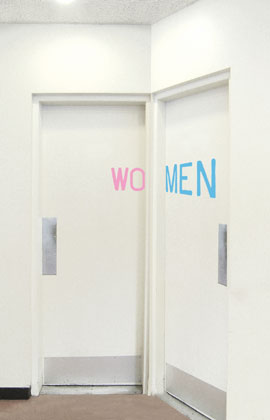
Julia made me look with this post about a smart bathroom signage solution by Aliza Dzik. (I only wish the type wasn’t in the stereotypical pink/blue.)

Julia made me look with this post about a smart bathroom signage solution by Aliza Dzik. (I only wish the type wasn’t in the stereotypical pink/blue.)
sweet
Mar 24th, 2009 / 12:45 pm
The pink and blue complete the thought. It would be less clear without it.
And you do want a high level of certainty when you walk through a closed door in a public building.
A synonym of “prejudice” is “mental association.” Some mental associations have greater value than their, er, prejudicial effect, and some don’t.
Mar 24th, 2009 / 1:41 pm
Its interesting how our culture views color associations. I’m wondering how they differ from america, to other countries, to the past.
Mar 24th, 2009 / 3:34 pm
Yeah I agree with dollared. It’s really clever without it being impractical. The “stereotypical” pink and blue makes it clear to the average person.
Mar 24th, 2009 / 6:05 pm
I have to say, while I love the design, without the pink and blue, some people just wouldn’t get it.
Mar 24th, 2009 / 6:34 pm
I wonder, does this mean that women can use either room, but men only the men’s room???
Mar 24th, 2009 / 10:59 pm
@Niki Brown: the colour pink as a “female” colour is used in western europe only after the 1920s.
Before, pink was used for boys. The colour purple was very expensive to be used for clothes in ancient times. Only the very rich (=kings) were able (and allowed) to use it. Pink, the “smaller” purple, was used for the “little kings” a.k.a. male children of the kings.
Blue was always the colour of Holy Mary in the christian tradition. Therefore, light blue was the colour for girls.
It all changed around 1920 after World War I were blue was associated with males because of the blue uniforms of the marines and the (male) workers. The coloured clothes had to be hand-washed. Children’s clothes had to be washed more often. The colour was not washing proof and degraded over time.
=> light blue for boys, pink for girls
(info partly from german Wikipedia “Rosa (Farbe)”)
Mar 25th, 2009 / 3:24 am
That is wonderful! Briliant!
Mar 28th, 2009 / 12:31 am
I think they used stereotypical colors just to clarify any confusion less intelligent people might conjure up.
Mar 29th, 2009 / 9:53 pm
@ Alexander Forst-Rakoczy
you said it. this topic fascinates me. i need to do more research on this.
Apr 2nd, 2009 / 2:39 pm
@Alexander
That is a very interesting piece of history, thank you very much for sharing it!
May 3rd, 2009 / 8:01 pm
The signage is cool, i like the color combination of the two.
Nov 14th, 2011 / 6:05 pm
Such an innovative smart bathroom signage solution…. I really enjoyed the signage…. I love your articles here they are interesting to read. Thank you
Dec 8th, 2011 / 11:46 am