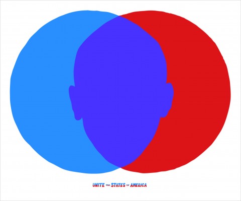
Aaron Allen, Creative Director at Wieden+Kennedy, designed this *amazing* poster for Obama’s campaign titled Unite The States Of America. Simple, powerful, beautiful. Hat tip! (They are 2-color screenprints and apparently there are a few more for sale. Email him if you’re interested. He added his email in a comment below.)
Wow this is so great. I love the power behind it’s beauty. The whole red and blue thing, along with the impact of the circles for votes. I think this expresses a lot of thought with some simple shapes. The best part of all, is that the Obama head in the middle is shaped very much so like his head is in real life. Kind of made me chuckle.
Mar 17th, 2009 / 2:57 pm
Nice, though the concept is lifted from a Jeep campaign done overseas in 2008… where exactly slips my mind.
Mar 17th, 2009 / 2:58 pm
I still have some of these prints left. If you’re interested in buying one please email me.
[email protected]
Mar 17th, 2009 / 3:11 pm
Don’t like it. And if it was true the center color would be purple. :D
Mar 17th, 2009 / 4:56 pm
Chis: Not necessarily if the red was printed first, then a slightly translucent blue on top. It might just make it darker (which it looks like it did).
Mar 17th, 2009 / 5:09 pm
This is really great, double hat tip. :)
Mar 18th, 2009 / 1:47 am
Hey – doesn’t that look a lot like the MasterCard logo?
Mar 18th, 2009 / 3:08 am
oh yeah – that should be Maestro, MasterCard’s debit brand
http://www.gibzone.com/images/maestro_logo.jpg
Mar 18th, 2009 / 3:10 am
The center IS purple, sillies!…just looks transparent next to the two colors, which is an effect you learn in color study.
Mar 18th, 2009 / 8:38 am
Minimalism at its best! :)
Mar 18th, 2009 / 9:43 am
I agree that most Americans (who have never studied color theory) would see the center color as darker blue, and that this hurts the message of an otherwise lovely design.
Then again, if it was originally a 2-color screenprint, the RGB image on my screen right now probably a very poor representation of the actual colors on the poster…
Mar 18th, 2009 / 5:49 pm
I’m sorry for the confusion. The image on this site is a digital representation of what the final print looks like. It is not a photo of the print.
When it was actually printed, the inks were mixed with transparency. The red was printed first so depending on whether the red dried completely before printing the blue, the center color varies anywhere from navy blue to purple.
(The original print was in the Manifest Hope DC gallery show in January.)
I have more images of it at:
http://www.flickr.com/photos/12753484@N08/
Feel free to email me with any other questions.
[email protected]
Mar 18th, 2009 / 9:32 pm
This is really great. I like it because of its’ simplicity- along with being unpretentious it has a high emblematic regard. The simplicity of the picture gives an open opportunity for interpretation- for instance politics. In Denmark, the colours red and blue represent the oppositions of the political boundaries. For instance blue is representive for rightwing conservative values and red is respectively leftwing ideals. Taking that into regard it cooks your noodle raises questions like what kind of policies does Obama substatiate??
Mar 19th, 2009 / 1:14 pm
looks like a mastercard logo to me- which was what I immediately thought of, which I suppose works- we are a consumerist society after all.
Mar 19th, 2009 / 3:13 pm
The name and theme of this reminds me of <a href=”http://www.flickr.com/photos/31219120@N03/sets/72157613764730093/”.States United by Greg Beauchamp
Mar 19th, 2009 / 4:36 pm
Try that again…
The name and theme of this reminds me of States United by Greg Beauchamp
Mar 19th, 2009 / 4:36 pm
This is sick!
Feb 8th, 2012 / 4:10 pm
Batman star Joseph Gordon-Levitt will ‘absolutely’ appear
in “Justice League”. But in fact, if people eat breakfast too
early, it is neither good for health, nor be harmful the stomach.
A flawless, picture perfect and natural looking smile
is closer than you actually think.
Apr 14th, 2015 / 11:38 pm