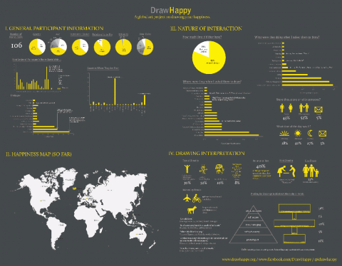
In asking [100] people, locals and tourists alike, what made them happy, Catherine Young realized that one of the most universal and clearest ways to record their responses was to ask them to draw what made them happy. Drawing is one of the earliest skills we learn; its basic elements are comprehensible to people of all ages, cultures and nations. Catherine reasoned that if people knew that they were happy, they should be able to identify the source and moreover, visually embody this joy.
Here’s one the submitted drawings that made me smile:

Eating with friends by Desire Go.
One hundred six submissions into this project, she has decided to visualize what she has learned so far. Behold, an infographic:
 (click to view large)
Catherine presented this as a final project for Nicholas Felton’s Information Visualization class at the School of Visual Arts’ MFA Interaction Design program.
This is an ongoing project. If you would like to Draw Happy, yes, please do! Check the Submit page for details.
(thank you Liz)
FUN!
May 9th, 2011 / 10:07 pm
This reminds me of The Happiness Project that Charles Spearin did. He did interviews with his neighbours about what happiness was to them. He realized that when they evoke certain emotions, they almost sing! So he created music out of the interviews and added a few instruments, and so The Happiness Project was created.
You can check it out here: http://www.happiness-project.ca/
May 9th, 2011 / 10:41 pm
NIce, pitty they didnt get the map right (Slovakia vs Swiss).
May 10th, 2011 / 4:18 am
Very cool work.
(In the “Relationship to Me” pie chart, “Frends” is misspelled).
May 10th, 2011 / 6:33 am
Great catches, all! Thank you!
May 10th, 2011 / 8:59 am
Though the visualization is nice, it has no scientific value. The sample is by far to small (~100) and I don’t see any relevance of the visualizations. Maybe I don’t get the point but I think there is an inflation of visualizations of trivial data. And a final point, if your focus is really on visualizing and illustration you should at least try to avoid typos …
If you are really interested on some serious results, take a look at the dataset of the European Social Survey (round 3, well-being)
May 11th, 2011 / 7:49 am
Drawings and infographics, hooray! Great idea for a project to get a data set, and the inforgraphic looks really good.
It’s fantastic that this is an ongoing project too, gives you an opportunity to further expand your data, and gives us an opportunity to see all the drawings.
May 11th, 2011 / 8:54 am