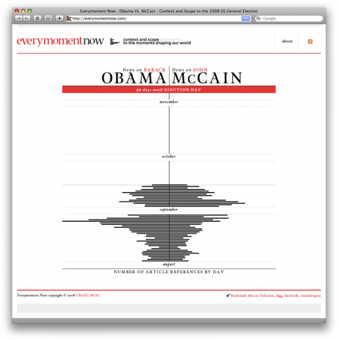
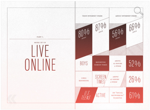
Everymomentnow: A visualization on news on Obama and news on McCain.
Mycrocosm from M.I.T. Media Lab
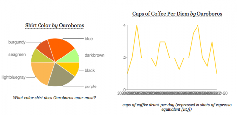
Mycrocosmos, a web service that allows you to share snippets of information from the minutiae of daily life in the form of simple statistical graphs.
(via khoi)
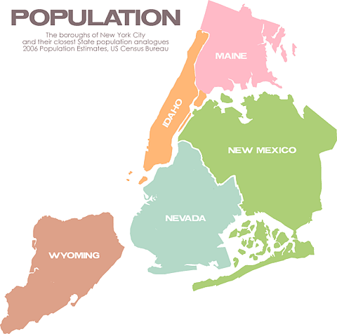
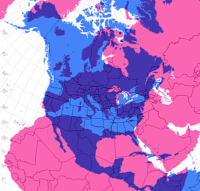
Brooklyn = Nevada
The Boroughs of New York City and their closest State population analogues 2006 Population Estimates, US Census Bureau
(via ffffound and no, I don’t have any invites, sorry.)
Beijing Olympics Pictograms
Pictograms being used for the events at the Beijing Olympics. Above is a variant the NY Times used in their Olympics section the other day.
(thank you adam)
barcode plantage
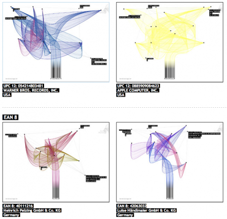
Barcode Plantage transforms a simple product bar code into a unique tree in the garden of globalisation.
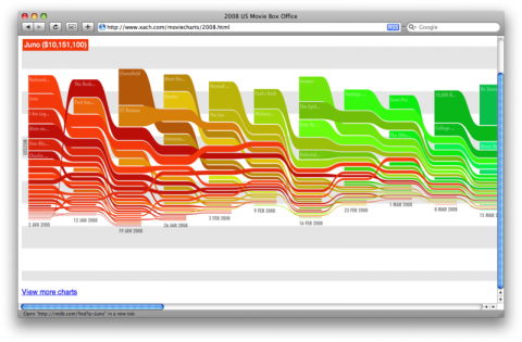
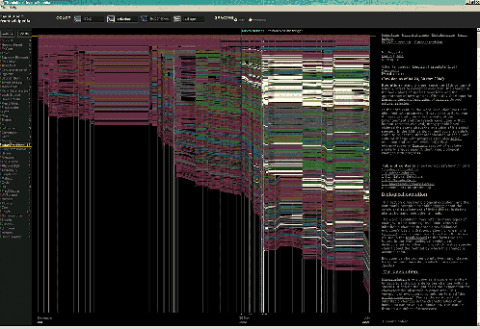
History Flow – Visualizing the Editing History of Wikipedia
History Flow is a tool for visualizing dynamic, evolving documents and the interactions of multiple collaborating authors. In its current implementation, history flow is being used to visualize the evolutionary history of wiki* pages on Wikipedia.
(via maxkiesler)
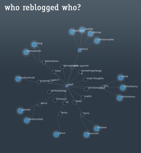
who reblogged who?
I wish there was a ‘who reblogged who?’ visualization tool, kind of a “Visual Thesaurus” of reblogging.
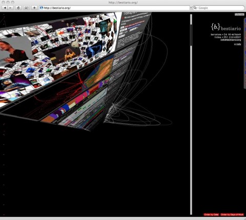
bestiario.org almost made my head explode…
bestiario.org almost made my head explode, but in a good way. Check it out. (Oh, and check this, if you are stuck in the office but are dreaming of being poolside.)
telling stories with type: “For all seasons”
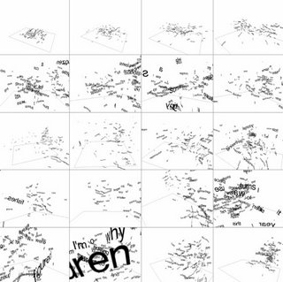
For Seasons is a poetic, typographic experiment about memories. This just totally made my day! Download “For All Seasons“!
(via olive is green)
Remembering How Many Cups in a Gallon

Memory Tricks: Remembering How Many Cups in a Gallon. It’s like “the woman who swallowed a fly” for cups and quarts!
(thank you faith!)
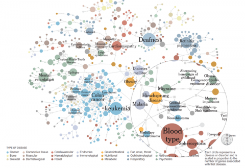
Mapping the Human ‘Diseasome’
Researchers created a map linking different diseases, represented by circles, to the genes they have in common, represented by squares. Related Article: Redefining Disease, Genes and All.
(via infosthetics)
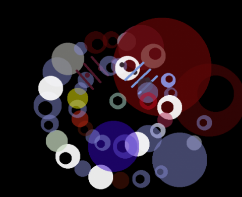
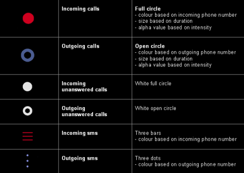
TODAY: visualized personal mobile communication
TODAY is a piece of generative design for mobile phones. It’s an application that visualizes personal mobile communication. It sits on the periphery of the machine, monitoring our connectivity through the number and type of calls we receive, subtly displaying them back to us, in the form of a generative graphic. Here, the visual result is a figurative and seemingly abstract picture – the story of your day. Some days will be really colourful and wired, others quieter and more reflective, either way the resulting visuals will always be personal, unrepeatable and unique.
(thank you rosa)
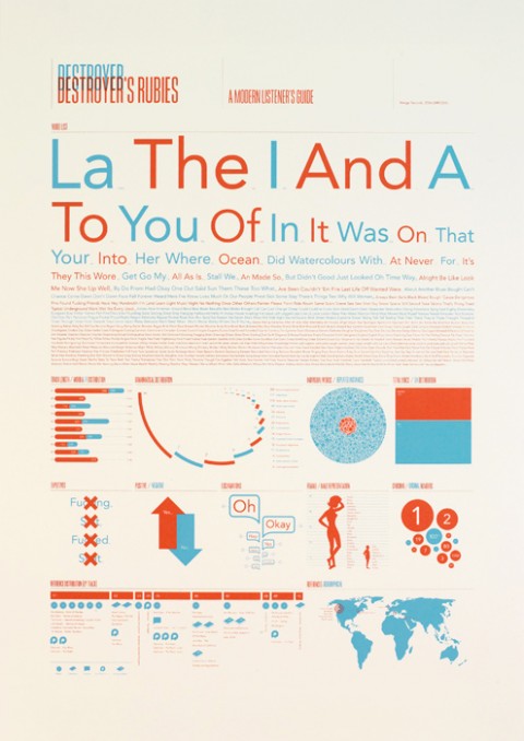
Destroyer’s Rubies
Destroyer’s Rubies, A modern listener’s guide, by Jez Burrows
typeSQL – typeface connection visualization
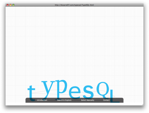
TypeSQL – typeface connection visualization tool by So, Won-young
Information Design Patterns
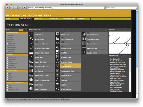
Information Design Patterns: An online resource accompanying a Master’s thesis on design patterns, by Christian Behrens. (took forever to load…)
(via chrisglass)
Hard Times
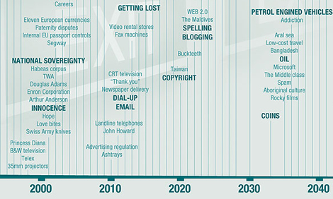
Nicholas Felton collaborated with author Matt Mason for Penguin Books. The result is what seems a lovely book called Hard Times.
