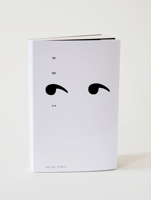
This book cover for George Orwells’ 1984 by Adronauts is stunning.
(via visual poetry)
The launch of Vine, the Instagram of video, has been fascinating to watch over the past few weeks. Obviously everyone is trying to figure out what works, but users like Mark Weaver sure found a unique way to play with the format. His LEGO Vines are my personal favorites. Imagine a stop motion art project using Lego bricks and Vine. See the growing archive over on legovines.tumblr.com.
Is there anything more fascinating than seeing how people live? In this case, IDEO founder David Kelley.

Tilman, an interaction and graphic designer living and working in and near Nuremberg, Germany, posts daily geometric compositions on Geometry Daily. Beautiful.
(via Chesley)
Our speaker at the July 2012 CreativeMornings here in New York was the charming and incredibly talented Kelli Anderson. She is an artist/designer and tinkerer who is always experimenting with new means of making images and experiences. You might have seen her TED talk, or maybe her paper record player? She is one of my all-time favorite designers. And she makes amazing fudge.
A big thank you to XO Group for hosting us in their beautiful office space. And a big thank you to Ben Hallman for filming + editing the video.


The one booth that stood out to me at the NYIGF was the one by Mr. Somebody & Mr. Nobody. Their products are beautiful and quirky at the same time. The retro radio pillow and the plucked chicken box won me over. Consider me a fan. These ladies will go far. Trust me.
“I move things around until they look right.”
– Milton Glaser
Milton Glaser explaining Graphic Design in an On Curiosity Interview.
Hey Australia, my fab studiomate Frank Chimero is coming to your neck of the woods this June. Make sure to grab a ticket for one of his talks in Brisbane, Melbourne or Sydney. More info over on portable.tv
Lucky Ducks!
Oh, and, buy his book! It’s fantastic!

I am completely fascinated by this poster series explaining complex philosophical theories through basic shapes. They’re designed by London based Genis Carreras.
(via coudal)

Thinkingform posted the above graphic by Swiss designer Peter Megert. I find the three interlocking arrows fascinating.

What happens when studiomate Frank Chimero takes a break from writing his book? This. A brand new personal site. His new site is a scrollable firework: Frank’s brilliant mind visualized. #hattip
(Book lovers, make sure to check out his library section!)
![]()
‘Pixel’ is a beauty of a limited edition print by Greig Anderson of Effektive. The print is available to buy here.
(via fiftytwonetwork)

Look, Milton Glaser has a new website, designed by LA Design Studio Ludlow Kingsley.

Less and More: The Design Ethos of Dieter Rams explores Dieter Rams’ work. #wishlisted.
Found it via Josh Clark’s List of Gifts for Designers, Nerds, and Mobile Mavens
Next time I take a walk in the woods, I’ll be on the look-out for these little creatures. Hat tip to the creator, David Lupeschen. Watch in full screen mode and with sound ON!
Ji Lee, former Creative Director of Google, now at Facebook just published a book called Word as Image. If you want to learn about Ji’s design philosophies, watch his fabulous CreativeMornings talk.
(thank you Ji)


This Viewmaster wedding invitation by Lesley Weiner integrates the couple’s engagement photos. Wonderful!
UPDATE: I apparently didn’t properly credit the work: The invite was designed by studio Melangerie Inc and Lesley Weiner worked collaboratively on the design. And you can get your custom invite over at Etsy.
A little over a year ago three German students tested the design viability of a shiny black cube. They asked established designers and design critics to assess the cube. Above is the video with design legend Dieter Rams.
I agree with Steve Heller, you’ll never look at a cube the same way again (or will you?).
Read more: Daily Heller: In CUBE We Trust
UPDATE: They just launched their site: the-black-cube.com


These letters make me happy. It’s a Screen Printed Letter Set by JP Boneyard Design and I want them all.
(via eighthourday)
While I am not crazy about the foul language in this stop animation, I am completely in love with the fact that Comic Sans fights back. The last sentence made me laugh out loud. The original monologue was written by Mike Lacher but the animation is by Joe Hollier who also created this amazing stop animation called My Visual Diary.
Here’s a question I asked iconic Swiss Designer Jost Hochuli at last night’s AIGA event:
Me: “What’s your definition of work?”
Jost Hochuli: “70% pleasure!”


The MoMA Department of Advertising and Graphic Design just launched their team website: www.momadesignstudio.org #twothumbsup
(thank you Jesse)


