Black Licorice poster by Dana Tanamachi. A beauty.
Black Licorice poster by Dana Tanamachi. A beauty.
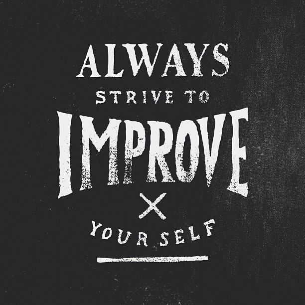
Beautiful and important reminder by Simon Walker.
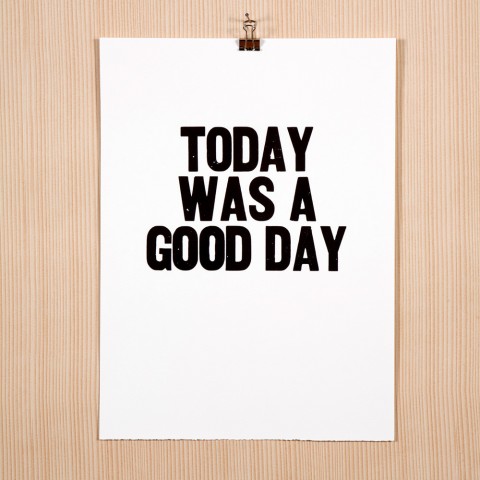
My inbox was full of good news today. A good reminder that I shoudl finally order this Today Was A Good Day Poster by Paper Jam Press.
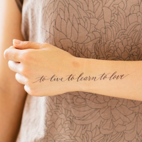
Really excited over today’s new Tattly launch. Designed by Lila Symons: To Live To Learn To Love.
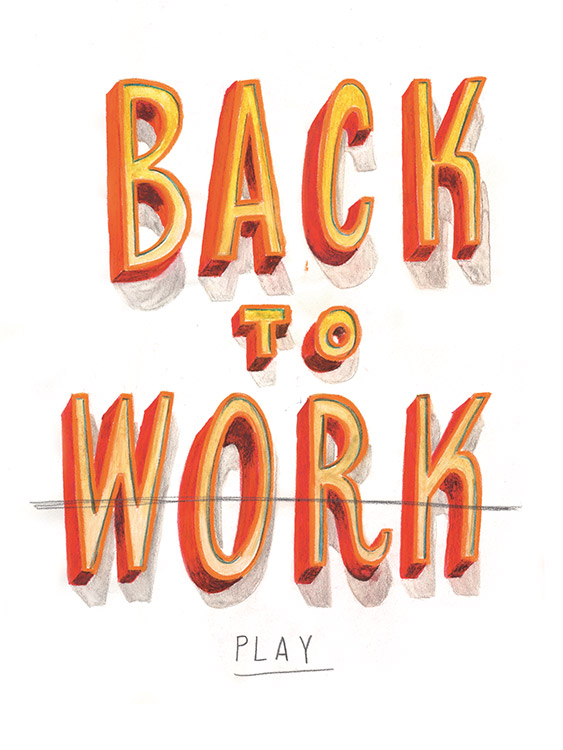
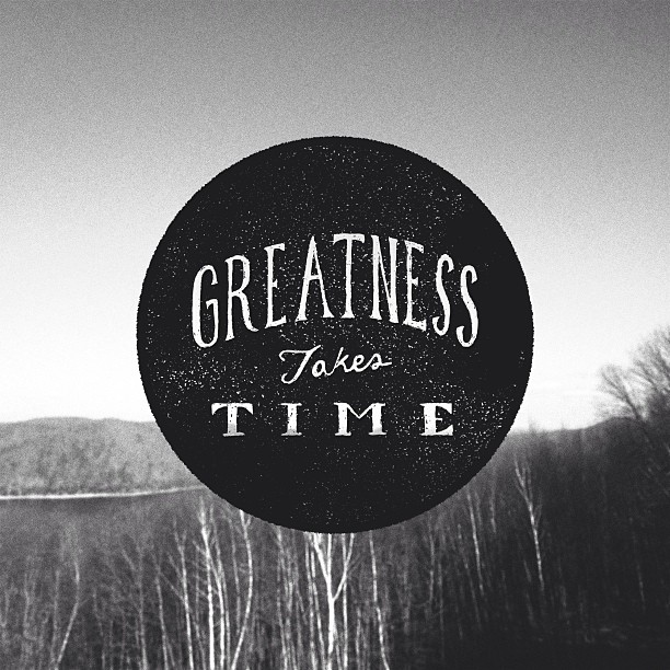
In case you read my previous post and have been playing Smileball since, it’s time to go back to work. Illustration by the talented Jeff Rogers.
My friend Cameron Moll did it again. He designed yet another historic architectural structure entirely out of type, this time, the Brooklyn Bridge. He is currently running a Kickstarter campaign to help pay for the letterpress printing cost. I am happy to see that he has already reached his goal, but there are still lots of fantastic rewards to be had. Go get yours!
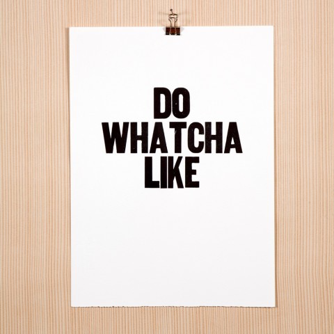
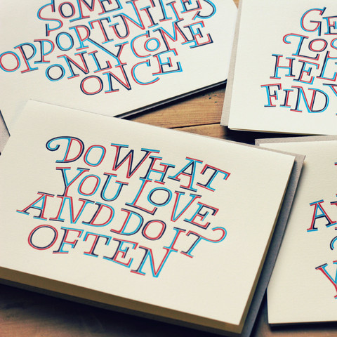
Do Whatcha Like, another lovely letterpress print Paper Jam Press.
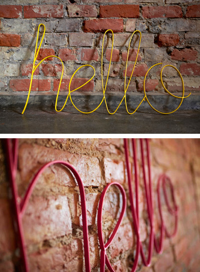
This Hello sign would look mighty good on our studio walls.
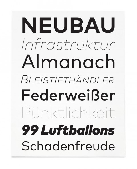
FontFont recently launched a beautiful new typeface called FF Mark. The new Germanetric sans is a collaboration between Hannes von Döhren, Christoph Koeberlin, and the FontFont Type Department, with creative support from the mighty Erik Spiekermann.
FF Mark has an impressive 10 weights ranging from Hairline to Black. Check out its microsite that showcases and celebrates the thinking and creative process behind the typeface. Well done, FontFont!
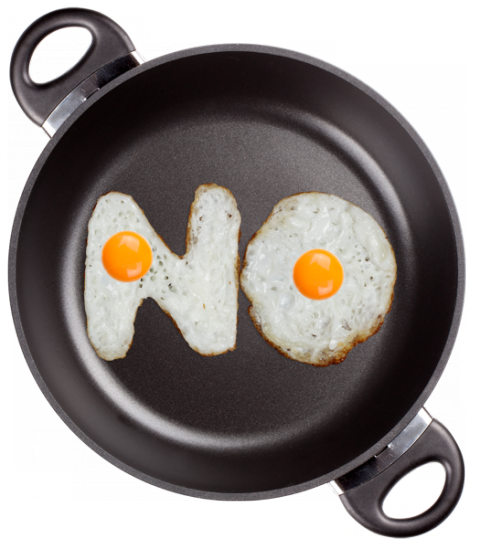
I took 1000 eggs, 10 pans, 5 burned fingers, 3 hours, 1 bottle of oil for this Typeface made of Eggs. It is made of high-resolution photos and contains of letters, symbols and numbers. Every letter has transparent background and ready for placement in your design.
(via)
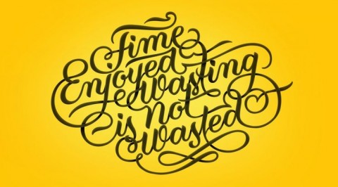
Time Enjoyed Wasting is not Wasted. Beautiful lettering by Patrick Cabral found over on Jessica Walsh’s and Timothy Goodman’s 40 Days of Dating Experiment Site.
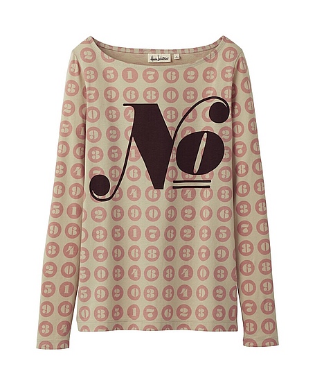
There’s nothing better than brands you love teaming up and turning up everyone’s dial of awesome to 11. In this case: House Industries + Uniqlo.
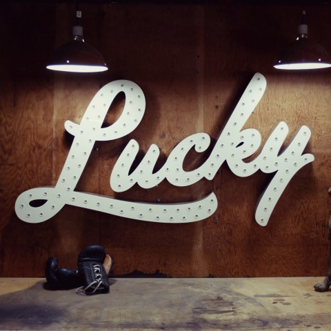
Currently drooling over this giant face-lit Lucky sign. A beauty, no?
$2,500 and it’s yours, made to order.
“Don’t have a favorite font. Do have a favorite type designer.”
– Jessica Hische
Excellent read: Upping Your Type Game, by Jessica Hische
I saw this minimal letterpress print by Ladyfiners Letterpress at the National Stationery Show. Must get one for the studio.
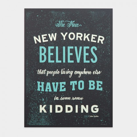
This quote by John Updike was part of my change of address card 13 years ago, when I decided to stay in NYC longer than just the initially planned 3 months. Congrats to the designers Michael Tabie and Karen Goheen of Two Arms Inc.
Isn’t it supposed to say “The True New Yorker *secretely* believes…”
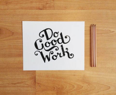
Do Good Work Letterpress print by Inkstomp.
Type designer Dave Foster created this beautiful letterpress card with a line from the Holstee Manifesto. Beautiful!
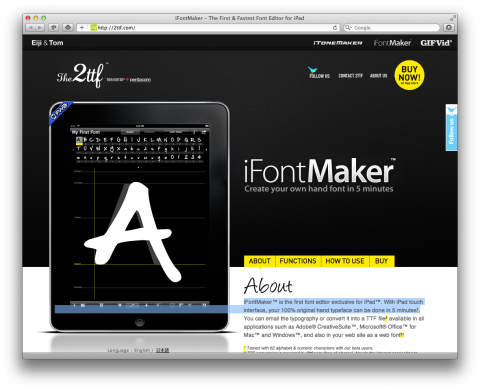
iFontMaker is an iPad font editor allowing you to create typefaces with the iPad touch interface in a matter of minutes. I’ll definitely try this with my daughter!
(via iA)
Who’s with me that these designs by Zachary Smith would make fab Tattly temporary tattoos?
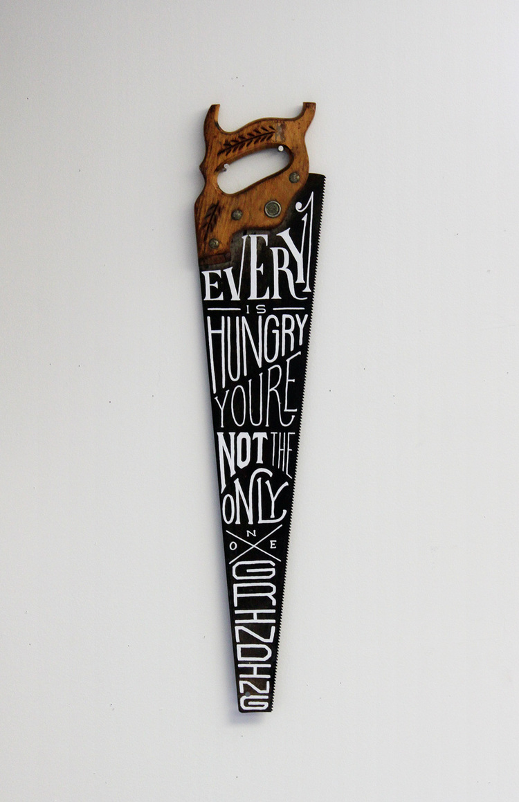
This hand-drawn saw by Zachary Smith is a beauty. Jude Landry is the lucky owner.
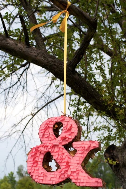
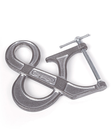
How ridiculously wonderful is this Ampersand Piñata?