A big thank you to Fontwerk for sponsoring my blog this week.
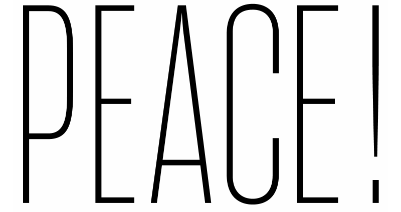
The brand new typeface by Daniel Perraudin is a compelling mix of conciseness and pragmatism. West follows in the geometric sans serif tradition, yet it achieves independence and its own distinct character. West has a simple yet sophisticated formula: visually similar forms do not repeat.
Bold, distinct and original — it’s perfect for branding, wayfinding and editorial projects.
Download free trial fonts on fontwerk.com (includes variable fonts).