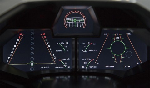
Having worked on a dashboard project last year for one of the big US car manufacturers, something like the above makes me look. It is the dashboard of the Lamborghini Reventón, the 20 owners of this car can also switch the dashboard screen to a more classic layout.
(thanks red / via today and tomorrow)

anyone else thinks this looks shit?
Mar 28th, 2008 / 10:34 pm
Yeah, very ugly! kinda like knight rider in the 80s …
Mar 29th, 2008 / 1:15 am
Well, to be fair, we’re not seeing it in motion and it is only one of the layouts that the Reventon can display. This particular one is meant to mimic a fighter jet. Looks pretty convincing to me. The only issue I have with it from a design perspective is how close the graphics come to the edge of the frame on the lower corners.
Mar 29th, 2008 / 3:50 pm
There’s a few clips on YouTube – [
[
briefly showing the dashboard… In use it sure looks very efficient/informational – like hinting at when to shift gear and visualizing the actual shifting.
Apr 2nd, 2008 / 7:10 am
I love this military look, you have to admit it looks pretty original in a car.
Does anyone know what typeface they have use in the logo and on the dash?
You can see it clearer here:
http://www.cartype.com/pics/3667/small/lamborghini_reventon_badge.jpg
Nov 18th, 2008 / 6:07 am