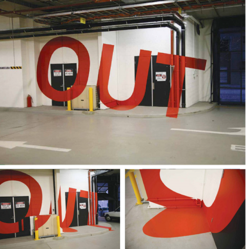
Check out this amazing way-finding-system for the Eureka Tower Carpark in Melbourne. The distored letters on the wall can be read perfectly when standing at the right position. This project won several international design awards and is the brainchild of Axel Peemoeller. Brilliant!
(thank you adam)

this is awesome!
Aug 1st, 2008 / 4:45 pm
Wow :-o
Aug 1st, 2008 / 5:05 pm
this is great – i remember seeing something similar a year or so ago, outdoor, big lines painted on buildings. anyone else recall this?
Aug 1st, 2008 / 8:34 pm
I like and dislike this at the same time. Strange!!
Aug 1st, 2008 / 10:18 pm
Hasn’t this type of project been executed by David Carson (and so many others) before?
Aug 2nd, 2008 / 1:45 am
the idea is not new, so i wonder why this project won several international design awards… check out
http://www.varini.org
i think felice varini is the real master of these amazing three dimensional paintings. he is doing this since 1979!
Aug 2nd, 2008 / 4:29 am
an identificational sign that can be only seen from one position in the space, and not from a vehicle either, form over function me thinks!
Aug 2nd, 2008 / 11:56 am
It may not be the most effective if it can only be seen from one vantage point, but it’s still very visually striking…even if it has been done before. It made me say wow.
Aug 3rd, 2008 / 3:16 am
If you are in the right position you don’t need the sign, if you are in the wrong position you can’t read it. How is this good design? Am I supposed to stumble aimlessly around the garage until the instructions jump out at me? I’m with ed on htis one, art but not signage.
Aug 5th, 2008 / 4:49 pm
I agree also.
This is art but not signage.
The problem is that is someone eleses art.
I really love the art of Varini.
Aug 6th, 2008 / 9:29 am
trompe l’oeil parking structure signs . . love it.
Aug 6th, 2008 / 4:19 pm