Maybe Money Does Buy Happiness After All, by David Leonhardt
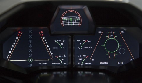
Reventón Dashboard
Having worked on a dashboard project last year for one of the big US car manufacturers, something like the above makes me look. It is the dashboard of the Lamborghini Reventón, the 20 owners of this car can also switch the dashboard screen to a more classic layout.
(thanks red / via today and tomorrow)
Semantic Web Gang forms, debates Semantic Web ‘readiness’
Alex posted about the first episode of Semantic Web Gang – a podcast focused exclusively on Semantic Web. Download the MP3 (60mins, 55MB)
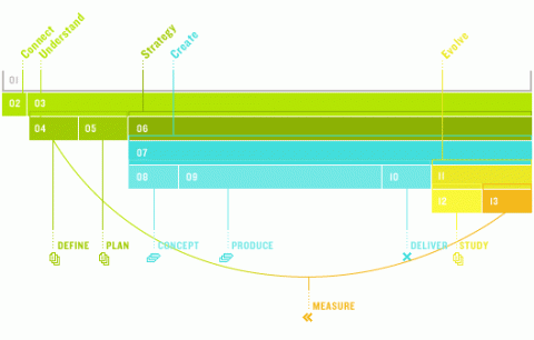
approach graphics
I think I am going to start a collection of ‘our design approach visualizations’. Here’s another beautiful one from ‘the ingredient‘. Not sure if it is necessarily very clear, but it sure looks impressive.
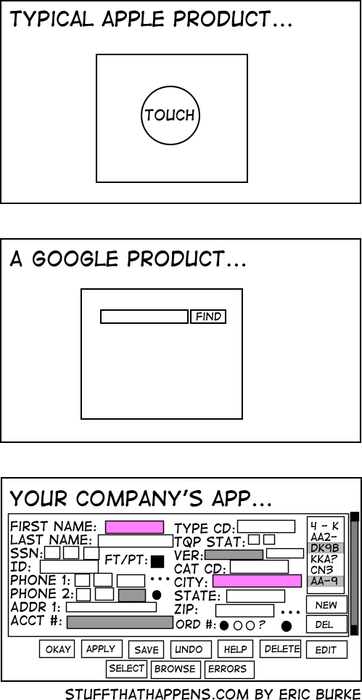
Still, my alltime favorite approach graphic, is this one. Makes me chuckle every time I come back to it.
Web Trend Map 3: Get it!
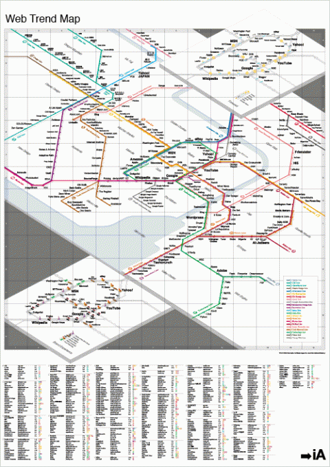
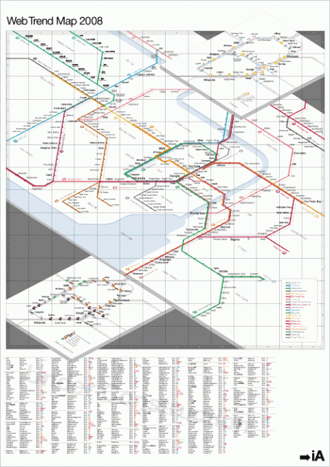
The Web Trend Map 3 is now available! Definitely the coolest gift for web-geeks. It’s an A0 poster of the 2008 Web Trend Map (841mm x 1189mm / 33.25in x 46.75in). (swissmiss feels honored to be featured on the map! Thank you iA team!)
NYTE – new york talk exchange
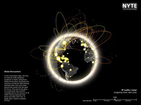
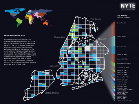
New York Talk Exchange illustrates the global exchange of information in real time by visualizing volumes of long distance telephone and IP (Internet Protocol) data flowing between New York and cities around the world.
In an information age, telecommunications such as the Internet and the telephone bind people across space by eviscerating the constraints of distance. To reveal the relationships that New Yorkers have with the rest of the world, New York Talk Exchange asks: How does the city of New York connect to other cities? With which cities does New York have the strongest ties and how do these relationships shift with time? How does the rest of the world reach into the neighborhoods of New York?
NYTE on exibition at
MoMA The Museum of Modern Art
Design and Elastic Mind
February 24th – May 12th 2008
(thank you matthew)
2008 Web Trend Map
Information Architechts Japan present the 2008 Web Trend Map, in all its beautiful beta glory. This time they’ve taken almost 300 of the most influential and successful websites and pinned them down to the greater Tokyo-area train map. By popular demand, they enlarged the poster size from A3 to A0. They guarantee it will make a great addition to your home or office. I am *thrilled* to find swissmiss on the map. Hooray!
Or view the clickable online version.
Navigation system gives drivers a visible lifeline
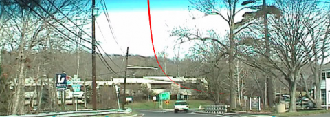
Follow the red line: Virtual Cable has designed a dashboard display that virtually ‘paints’ a line on the road ahead, showing directions instead of speaking them. WOW!
Web Trend Map v3.0 Countdown: New Layers
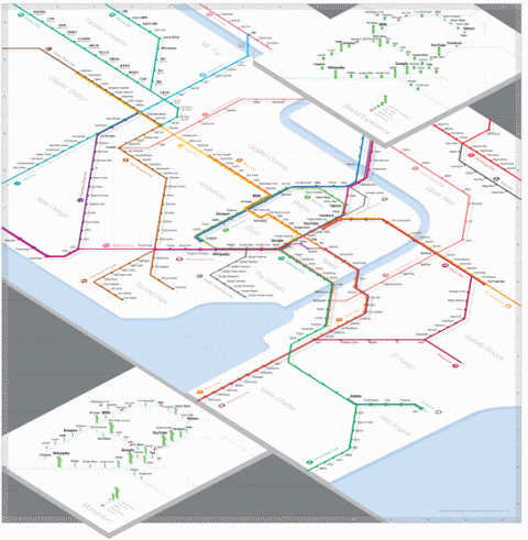
Can’t wait to see the new Web Trend Map v.3 that Oliver and his team are working on. They’ll present it today at the Tokyo 2.0 event. Those familiar with the new Swiss train station maps may recognize one source of inspiration. After meeting with their friend Adrian Schaffner from evoq, they studied his work with mapping the Swiss train stations and adopted a few of the concepts themselves. Instead of cluttering the main stations with additional information, we elaborated on their trends by adding two new layers: brand quality and interface quality.
CrashStat
CrashStat displays pedestrian and bicyclist fatalities from 1995-2005 on a Google Map of New York City.
(via social design notes)
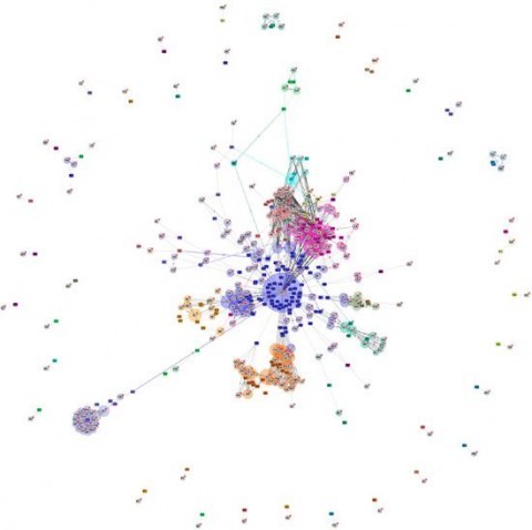
internet map | World City-to-City Connections
Internet Map, by Chris Harrison, a doctoral student at Carnegie Mellon University’s Human Computer Interaction Institute.
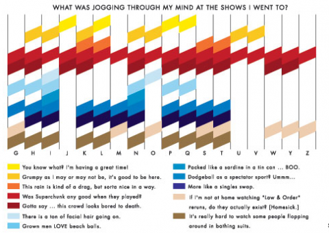
Andrew Kuo | Chart Master
Chart by New York based artist Andrew Kuo. Check out his blog or his contributions the The New York Times online.
(via onefloorup)
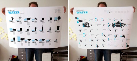
Virtual Water Posters
Timm Kekeritz, a Berlin based design student, designed a poster called “Virtual Water“, which illustrates the amount of water used to produce everyday products. The posters visualize parts of research data from a recent study of the UNESCO. Wonderful.
coding and decoding
Coding and decoding, originally uploaded by dgray_xplane.
Can you interpret all the codes you see above? If you can you might want to take a try at the codes in this Flickr photo set.
(via communication nation)
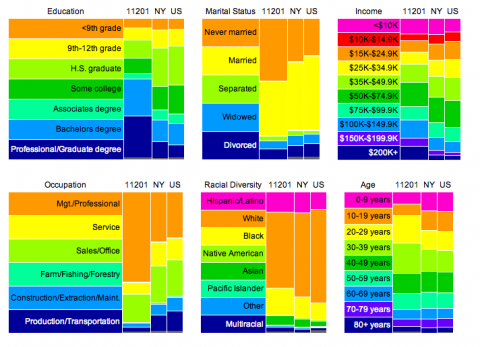
ZIPskinny
A few charts on my Brooklyn Neighborhood 11201. Resource Zip Skinny.
(via MF)
