human brain cloud

Picture_8

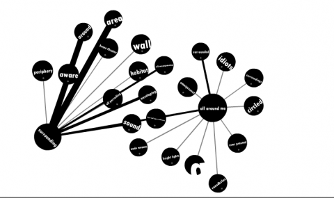
Human Brain Cloud
– a massively multiplayer word association “game” /experiment: The idea is that given a word, a player types in the first thing that comes to mind and the results are combined into a giant network.

For instance given the word “volcano”, a common word people might submit would be “lava”, and this would result in a very strong connection between “volcano” and “lava”. On the other hand, given the word “volcano”, fewer people might associate it with something like “birthday party”, resulting in a very weak connection or no connection at all. Over time and with many players, I hope the cloud will gradually grow to represent words and phrases people tend to associate with other words and phrases, assuming it doesn’t get inundated with spam. The cloud started with just one word, “volcano”. All other words were submitted by visitors to this site.

(via oh my attention)

ratings: color bars instead of stars

Picture_3

Summize, a price comparison site, offers a new way of displaying ratings: colored bars, which summarize the reviews : the more green, the more positive they are. Where stars only give an average rating, those color bars really add some depth to the information. And I love how their rating system is graphically reflected in their fav-icon.

I agree wth David Abbet: Simple, elegant, useful.

my harddrive usage- visualized

Picture_34

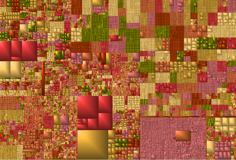
My harddrive usage – visualized – thanks to GrandPerspective.

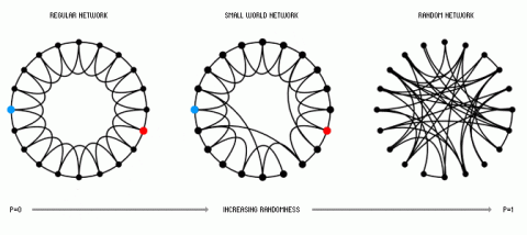
Social Graph: Concepts and Issues

P3

Social Graph: Concepts and Issues, by Alex Iskold

The Indo-European Family of Languages

Indoeuro

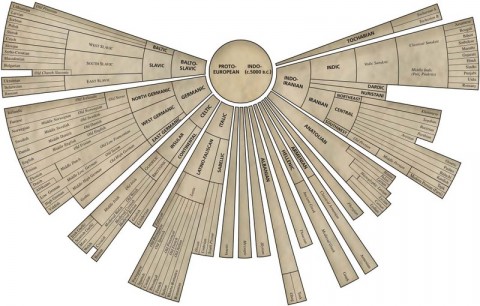
Family tree of Indo-European languages, by the American Heritage Dictionary of the English Language. Wait a second, where’s my native language,swiss german, on this map?

(via anil dash)

catalog tree

000701image

Picture_5

000709image

000719image

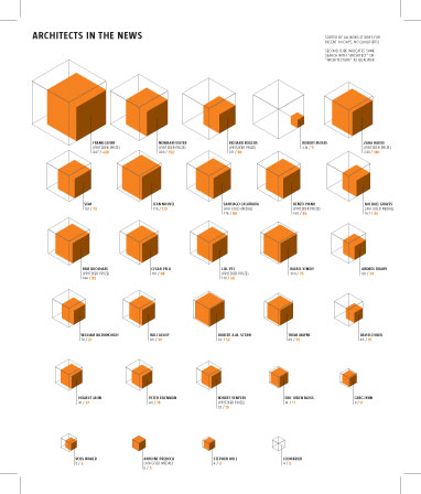
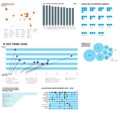
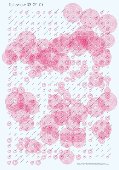
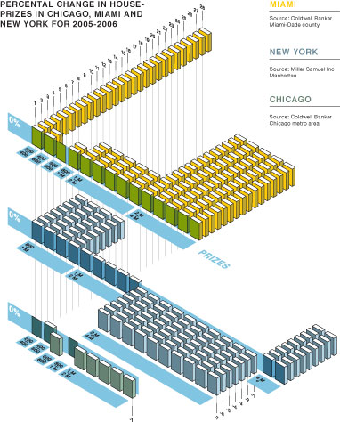
Beautiful Information Grahics by Dutch CatalogTree

(via core77)

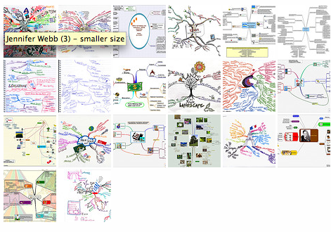
idea mapping | a flickr set

Picture_3

Idea Mapping Flickr Set

(via xblog)

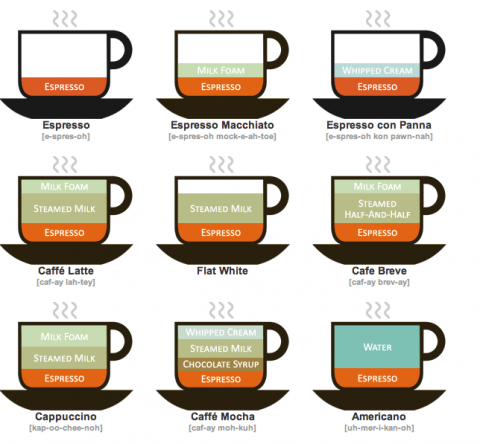
coffee drinks illustrated

Picture_9

Coffee Drinks Illustrated

(via chrisglass)

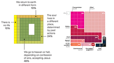
Pixels Are The New Pies

Squaregraphs

An interesting infographic trend: Square blocks of color are now being used to represent percentage-based statistics instead of the traditional pie chart. Pixels are the new Pies

Data Visualization: Modern Approaches

Shapeofsong

Data Visualization: Modern Approaches

(thank you dana)