960 grid system

Picture_4

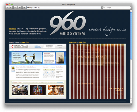
The 960 Grid System, by Nathan Smith, is an effort to streamline web development workflow by providing commonly used dimensions, based on a width of 960 pixels. There are two variants: 12 and 16 columns, which can be used separately or in tandem.

The 12 column grid is divided into portions that are 60 pixels wide. The 16 column grid consists of 40 pixel increments. Each column has 10 pixels of margin on the left and right, which create 20 pixel wide gutters between columns.

All modern monitors support at least 1024 × 768 pixel resolution. 960 is divisible by 2, 3, 4, 5, 6, 8, 10, 12, 15, 16, 20, 24, 30, 32, 40, 48, 60, 64, 80, 96, 120, 160, 192, 240, 320 and 480. This makes it a highly flexible base number to work with.

Download (180 KB) ( Zip contains PDF grid paper, templates for Fireworks, OmniGraffle, Photoshop & Visio, and CSS framework with demo HTML.

(via twittering cameron moll)
Christopher Doyle ™

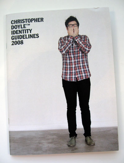
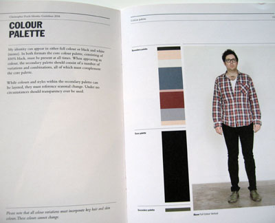
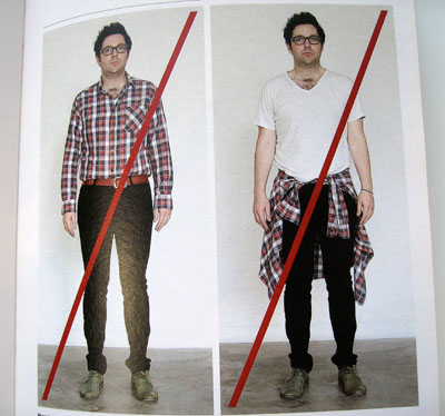
This made me smile: Sydney-based designer Chris Doyle has obviously done too many large identity projects recently – he decided to create a set of guidelines for himself as he began wondering ‘how my personal identity would be documented if it were considered in graphic design terms’.

386_cd_cover

386_cd_3
color palettes

386_cd_6
‘incorrect use’

Read the entire post over at johnsonbanks.co.uk.

(thank you jon)

ridiculousdesignrules.com

Picture_1

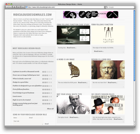
Like it or love it, we all have rules that help us at work. “Leave it until the last minute.” “Never use a PC.” They make sense because they work for you, and you alone. When you try and make someone else follow them, they stop working and become a joke. The problem is that every rule related to, or governing, design is ultimately ridiculous. Ridiculousdesignrules.com decided to give you a place where you could unload those pretentious sound bites about design you’ve heard from colleagues, clients or anyone else who thinks they know more than you. Designers don’t need anybody else to make us laugh, when we do it so well ourselves.

(thank you verena)

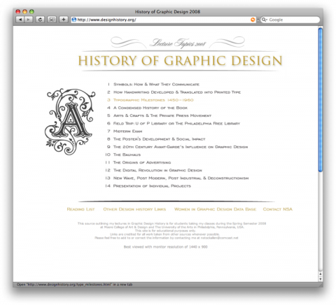
History of Graphic Design

Picture_19

Outlining lectures in Graphic Design History by Nancy Stock-Allen for the Moore College of Art & Design and The University of the Arts in Philadelphia

(via chrisglass)

How a page gets created

Matt Willey recently recorded his decision-making on a feature design for the Royal Academy magazine. It provides a very useful insight into how page designs get arrived at, one that anyone who’s ever designed a magazine will recognize.

(via monoscope)

Focus on Results, Not Time

Picture_14

We often assume that the number of hours spent at work are an indication of one’s effort, interest, and accomplishment. However, in reality, the greatest ideas and the execution of these ideas happen in spurts. The best ideas often do not require a lengthy conception, and the most productive days are seldom the longest.

Tip: Focus on Results, Not Time

The 10 Commandments of Web Design

1. Thou shalt not abuse Flash.
2. Thou shalt not hide content.
3. Thou shalt not clutter.
4. Thou shalt not overuse glassy reflections.
5. Thou shalt not name your Web 2.0 company with an unnecessary surplus or dearth of vowels.
6. Thou shalt worship at the altar of typography.
7. Thou shalt create immersive experiences.
8. Thou shalt be social.
9. Thou shalt embrace proven technologies.
10. Thou shalt make content king.

Part of a group of design experts, including John Maeda, Khoi Vinh, and Steven Heller, Jakob contributed to a BusinessWeek survey on what web design should look like in 2008. Check out the article by Matt Vella and watch a slideshow of the best and worst of the web.

(via trollback)

Making Sense of the Semantic Web


Nova Spivack at The Next Web Conference 2008 from Boris Veldhuijzen van Zanten on Vimeo.

(via buhlerworks)

First Things First Manifesto 2000

… We propose a reversal of priorities in favor of more useful, lasting and democratic forms of communication – a mindshift away from product marketing and toward the exploration and production of a new kind of meaning. The scope of debate is shrinking; it must expand. Consumerism is running uncontested; it must be challenged by other perspectives expressed, in part, through the visual languages and resources of design. …


The above is an excerpt of a manifesto that was first published in 1999 in Emigre 51.

(via sheepless)

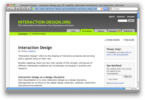
interaction design, an article

Picture_22

Jonas Löwgren (Professor of Interaction Design and apparently considered ‘Mr. Interaction Design’ in Scandinavia) just published an interesting article on ‘Interaction-Design.org’.

It paints a portrait of Interaction Design as a discipline going in two directions: One interpretation is to view Interaction Design as an extension of HCI. The proponents of this view are the old HCI-hardliners like Ben Shneiderman, Don Norman, and Jenny Preece. Another interpretation is to view Interaction Design as a design discipline, with more in common with architecture than with engineering and behavioral sciences.

Interaction Design, by Jonas Lowgren

(thank you mads)

67 Random Thoughts on Design

Picture_3

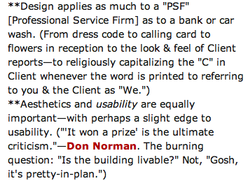
67 Random Thoughts on Design, by management consultant and leadership guru Tom Peters.

(via Lunch over IP)

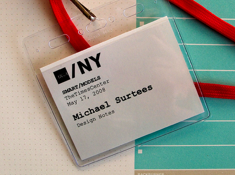
Notes from AIGA NY’s Smart/Models Event

Picture_17_2

Thank you Michael for covering the Smart/Models Event! Bummed I wasn’t able to make it.

Notes from AIGA NY’s Smart/Models Event

The Rise Of Contextual User Interfaces

The new interfaces are winning people over because they are based on usage patterns instead of choices. The key thing about new UIs is that they are contextual – presenting the user with minimal components and then changing in reaction to user gestures. Thanks to Apple, we have seen a liberating movement towards simplistic, contextual interfaces. But can these UIs become the norm? In this post we take a look at the rise of the contextual UI and ponder if they will cross the chasm.

The Rise Of Contextual User Interfaces, by Alex iskold

AMEN!

You say Tomarto….

341_tomato_400

Excerpt of JohnsonBanks latest ‘thought of the week’:

Here we are, 4 decades later, and things are a lot more complicated. In London alone you still have Müller-Brockmann devotees, but more for the ‘look’ of the Swiss style than anything else, a sort of Aesthetic Neo-Modernism rather than its more philosophical original form. Then you have another group of Closet Modernists who fall back on it in times of stress (or deadlines), dabble in ideas and might ‘play away’ from Univers and Helvetica every now and again (but only in an ironic way, you understand). There’s a whole group who wouldn’t know an ism from a schism but know a good grid when they see it – let’s call them the Gridnik Modernistas.

Read full post: You say Tomarto…

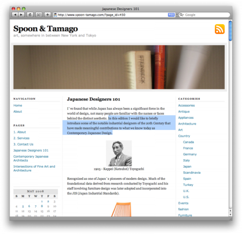
Japanese Designers 101

Picture_19

In Japanese Designers 101, Johnny Strategy introduces some of the notable industrial designers of the 20th Century that have made meaningful contributions to what we know today as Contemporary Japanese Design.

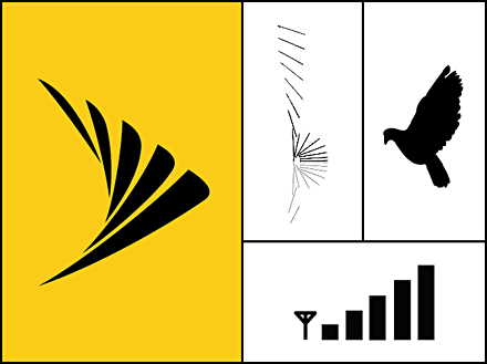
anatomy of a merger: Turning Two Logos into One

Sprintnextel03

Anatomy of a Merger, by Giampietro+Smith

The version of this article that was published on 15 September 2005 by BusinessWeek.com is available here.

One Show – Paul Rand Tribute Film (2007)

To Collaborate, or Not to Collaborate

Armin is asking: Do you work better alone or in teams? If you are a junior designer, do you enjoy heavy-handed creative direction, and working with other designers? If you are a senior designer, ditto? And if you are a creative director, how much do you rely on the collaboration between designers? Have I missed out on a great experience?

To Collaborate, or Not to Collaborate, by Armin Vit

LIFT08

Banner_carre_logo_dessinBruno is doing a fabulous job documenting the LIFT08 conference in Geneva. It is a three day event to explore the social impact of new technologies. Meet tomorrow’s most important trends, those changing our lives and organizations on a daily basis.Most of the talks given at LIFT are available for free at videos.liftconference.com. Fantastic! Thank you internet!

Look and Feel / Nip and Tuck

Look_and_feel_2

I first heard the term “look and feel” in the early days of web-design. I found it an odd phrase. When web developers used it I couldn’t be sure if they were talking about graphic design or some new hybrid form of design for the web and computing. Today, the term has seeped into everyday usage, and it has become widely used by commissioners of graphic design.

Why? Is it because it’s a piece of useful shorthand that emphasizes the importance of usability in modern strategy-driven communications? Or is it a babyish term that reduces the designer to the role of decorator — someone who gets asked to “color-in” strategic plans made by smart marketing wonks who think design is a no-brainer?

Look and Feel / Nip and Tuck by Adrian Shaughnessy

(make sure to read the comments on this post. highly amusing!)

The History of Visual Communication

Picture_7

The History of Visual Communication. Bookmarked. Need time to sit down and read.

(via chrisglass – the finder of good stuff)

Paula Scher Says Get Rid of ‘America’ and Ditch the “Star Spangled Banner,” But Keep the Flag

Paula_monocle

Future States,” a rebranding of the US by Paula Scher. Unfortunately, the Monocle print piece is (still) only available to subscribers, but there’s a video component, Brand America, an interview with Scher conducted by Tyler Brûlé. In it, she advocates trashing several visual icons of the USA brand, including the “America” portion of our name. Which is funny, since she designed the book on America.

(via the fabulous unbeige alissa)

What font says ‘Change’?

1201369426_0617

Type designers decode the presidential candidates: What font says ‘Change’?

(via chrisglass)

How to be schooled.

Howobeschooled

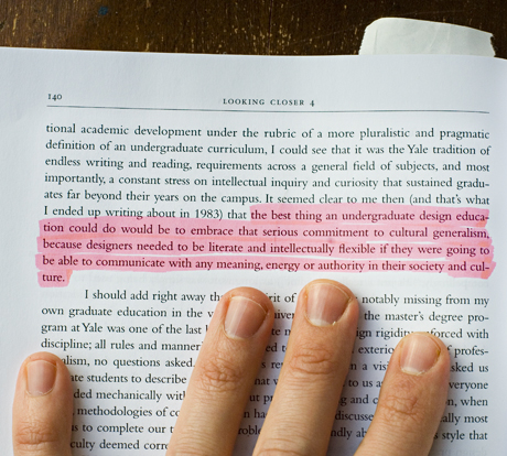
From an essay by Lorraine Wild