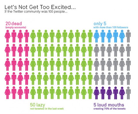
Some interesting stats about the much-trumpeted Twitter community – visualized!

(originally uploaded by mkandlez)
(via @GuyKawasaki)
Some interesting stats about the much-trumpeted Twitter community – visualized!

(originally uploaded by mkandlez)
(via @GuyKawasaki)
If the community was only 100 folks, how would 5 have more then 100 followers? Haha.
However thats a great illustration! I’m definitely glad there are more then 100. I just wish all the “free money” folks would stop already!
Jul 30th, 2009 / 10:47 am
i guess this could kinda apply to today’s society! the ‘dead percentage’ would be the people just not living their lives but a total binary opposition of what this chart actually stands for.
Jul 30th, 2009 / 12:26 pm
IDK about you, but I don’t really want a ton of people following me. I still want to hold onto Twitter as a service that helps me stay in touch with friends and very select institutions. I have less than 50 followers and I feel like I use the service to it’s fullest. That’s enough reason for me to get excited.
Jul 30th, 2009 / 1:44 pm
So it follows the 80/20 rule of business. 80% of your business comes from 20% of your customers.
Jul 30th, 2009 / 3:20 pm
What do the 20% gray ones represent?
Jul 30th, 2009 / 3:39 pm
i’ll be in the grey are.
wanting to twit but not knowing what to say in less than 100 words.
Jul 30th, 2009 / 10:50 pm
Looks very similar to any cross section of a community to me.
More is said by just a few. Most are willing to follow rather than lead. It’s not so much a reflection of Twitter, as a statement about human nature.
Jul 31st, 2009 / 8:11 am
Oh how true that is…maybe we should create a new “100 followers” only rule and see how much more productive it gets us?
Jul 31st, 2009 / 8:47 pm
Thank you Will d. White. I was having trouble with that math too.
Jul 31st, 2009 / 8:54 pm
I love it. So Blunt and straight to the point.
Aug 2nd, 2009 / 9:57 pm
Isn’t it annoying when someone looks at the source data
Are you excited about this twitter chart?
Aug 3rd, 2009 / 8:05 am
Literally every piece of data exposed by this graphic is wrong.
All four cited percentages are wrong.
A network with 100 users by definition has zero people with an excess of 100 followers.
The gender roles you took the time to place are off by nearly 40% (which given your 50% estimate is pretty impressive).
The dead account number you cite, 20%, is especially useless because in addition to being nowhere near a correct number, it doesn’t define dead account (one assumes you mean haven’t tweeted in the last N months, but for each consecutive value of N that number shifts pretty dramatically; to get it to 20% you actually have to set it to shorter than your lazy timeframe.)
Could you maybe cite your sources next time? I kind of don’t like receiving infographics from my coworkers who want to make decisions based on data you pretty much just made up.
Aug 3rd, 2009 / 9:27 pm
The info-graphic is a sad excuse for making pretty looking charts that are deceiving. It has so many pitfalls that I dont know where to begin.
1. It conveys that dead accounts are separate from lazy ones. If you think for a sec, you will realize that dead is a subset of lazy. The source confirms it too.
2. It conveys that there are no overlaps. This is entirely wrong. There are several overlaps
3. It fails to tell what the gray ones are.
4. The maker of this just took 4 different stats and mixed them in one chart without even questioning whether there are any overlaps.
@Andy: “Isn’t it annoying when someone looks at the source data”
We should always look at source. Otherwise, we will form wrong opinions.
Aug 5th, 2009 / 6:57 am
I feel like the male/female ratio isn’t 50/50. Is this an assumption or based on true data?
Aug 7th, 2009 / 10:02 am
Stonecyphyer / Chandoo – thought about taking an OCD test??
Aug 20th, 2009 / 11:53 am
@Tim… thanks, good luck forming false opinions..
Aug 20th, 2009 / 12:21 pm
Thanks for ones marvelous posting! I truly enjoyed reading it,
you can be a great author. I will remember to bookmark your blog and definitely will come back sometime soon.
I want to encourage that you continue your great
posts, have a nice holiday weekend!
Oct 30th, 2012 / 2:32 am