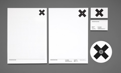

This identity and branding for Melbourne based Cross Section Studio made me look. Designed by Thomas Williams of Hunt Studio.


This identity and branding for Melbourne based Cross Section Studio made me look. Designed by Thomas Williams of Hunt Studio.
Wow. That top image isn’t all that far from a nazi flag. I’d rethink putting the X in a circle.
Sep 8th, 2009 / 10:46 am
@ tina
Me too, instantly associating the same image.
Quite klu-klux-klan-esque…
Sep 8th, 2009 / 12:11 pm
Yes, me too!
I was like: ” Ooops, are the kidding?”
Sep 8th, 2009 / 12:25 pm
It’s a big year for them pesky Nazis; a feature film, they’re implicated in the health care debate, and now this.
I’m not sure I would have thought swastika if it hadn’t been for the circle of the DVD on the gray background. Black X is also part if the problem.
Turn it 45º and you have an entirely different impression, and almost the logo for Crossroads Films. I’m just saying.
Sep 8th, 2009 / 1:25 pm
Looks like The xx’s xx album art.
Sep 9th, 2009 / 12:45 am
That’s exactly what I thought damon
Sep 9th, 2009 / 7:08 am
Wow, I guess here’s where a ‘visual history’ of a nation shows. I did not for a second think of what all the others seem to be seeing. Keep in mind this is an identity for a company in Australia. Different history, I guess.
Sep 9th, 2009 / 8:45 am
I certainly see it. I think the problem stems from the gray background used to define the featured applications; it is strikingly similar to that of the National Socialist German Worker’s Party flag as seen in black & white photographs. Taking into account how we (in the U.S.) are regularly exposed to it—thanks to the likes of the History Channel—I’m not surprised by the unfortunate association.
Sep 9th, 2009 / 5:37 pm
It is very interesting and eye-catching. Because we’re very much in a global economy, I think Cross Section needs to seriously reconsider the direction they’ve taken with this. Before reading the rest of these comments, I couldn’t not get past the feeling that this was a Swastika redesign.
If a major purpose of a brand is to invoke a positive feeling or reaction, then this one really misses the mark…at least for those of us who are familiar with WWII history.
I agree with Alex that the vintage b&w photographic feel only adds to the perception. If they did away with that, the association with the deplorable history would probably lessen, but so would the visual impact.
Sep 10th, 2009 / 3:15 pm
Is a carbon copy of the 1998’s Una Semana en el Motor de un Autobús CD artwork by Los Planetas
Sep 16th, 2009 / 5:45 am