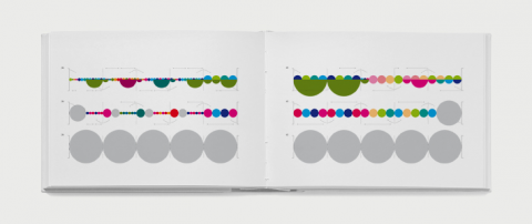
Laia Clos’ studio mot designed this data visualization of The Four Seasons by Antonio Vivaldi. lesquatrestacions is a graphic information system for visualizing the lead violin of Vivaldi’s masterpiece. The work consists of four posters, a set of stamps and the documentation of the system.
(via datavisualization.ch)


Wow!
A previous intern – Helen Stelthove – took on the exact same project a year ago. The results are on her website here: http://helenstelthove.com/project.php?project=11
Aug 11th, 2010 / 7:20 am
While I think that the posters are gorgeous, the graphic system used doesn’t actually help visualize anything more clearly than just reading the sheet music. The addition of color and circle size don’t seem to add any clarity to the overall design – or am I missing something?
I would just love to be able to look at this and learn something new about the music.
Aug 11th, 2010 / 8:54 am
Visually, it’s quite exciting to look it, reminds me of Information is Beautiful.
Aug 11th, 2010 / 11:09 am
The main difference between this system and the sheet music is the observation of rhythm. Size here represents duration (time), unlike in musical score and knowing the colour coding helps looks at musical harmonies. Perhaps if you compare all 4 posters, you will see how the different musical scales and rhythmic styles of the four concertos are being compared. An interesting thing would be to observe the style of different composers and of course different instruments since this is the translation of the score for the lead violin (lead, second and third violin in the book).
Aug 25th, 2010 / 8:42 am