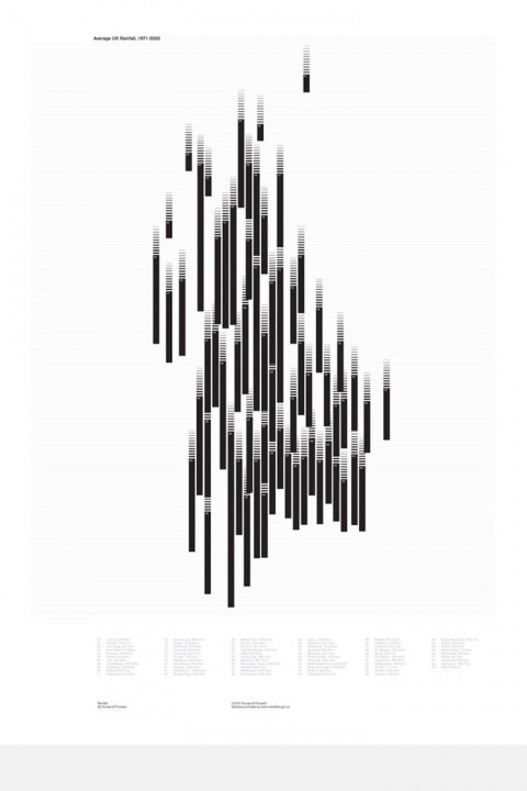
David of UK based design company Accept & Proceed pointed me to their fabulous A1 hand printed diagrams, the latest being a graphic diagram that charts average rainfall in the UK between 1971-2000. As you can see on the image above, the graph itself is styled to look a little like a downpour of rain. The bars are plotted directly over the weather station’s that they related to, which also gives an abstracted map of the UK.
This (and other amazing) posters are available through Blanka
very nice. this is roughly the same sort of representation the NYT uses for temperature extremes from their contracted Penn State weather page.
Aug 30th, 2007 / 7:00 pm
what does this mean??????????????
May 23rd, 2008 / 9:02 am