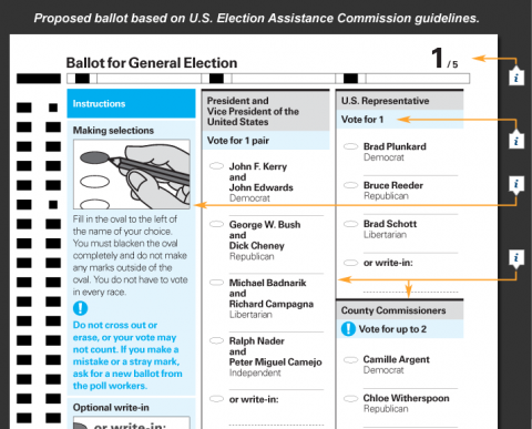
On Nov. 4, most ballots will repeat design mistakes made in previous elections. Many of these errors are avoidable. This year, the United States Election Assistance Commission released ballot design guidelines. Using these guidelines, AIGA developed this feature to identify common design problems and offers improvements. How Design Can Save Democracy, By Richard Grefé and Jessica Friedman Hewitt
(thank you olga)

The drawing of the hand filling in the oval has no visual cue as to where the name is.
A flaw.
Aug 25th, 2008 / 8:48 pm
I can attest to the ease of use of this type of ballot. Oregon has been a 100% vote-by-mail state for quite a few years now, and our ballots look very much like the picture above.
You always know exactly who or what you are voting for. Doesn’t mean everyone always votes the right way (*cough*bush*cough*) but at least they are sure of their vote. :)
Aug 27th, 2008 / 12:16 am
AIGA has promoted this book and people in the design community seem to really appreciate it. I have seen it and like the systematic approach and the solutions it offers.
However, I think it’s a shame that it stopped at the book. Why is this not federal law? Have the authors followed up by lobbying congress (and states) to implement this? Or are they waiting for gov to call them?
It’s one thing to have an idea, and another to make it happen in the real world. Maybe in 2010, or at least 2012.
Feb 16th, 2009 / 2:49 pm