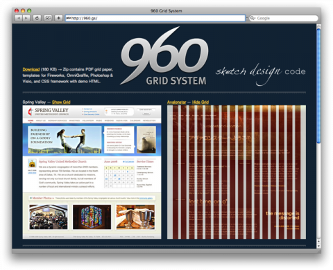
The 960 Grid System, by Nathan Smith, is an effort to streamline web development workflow by providing commonly used dimensions, based on a width of 960 pixels. There are two variants: 12 and 16 columns, which can be used separately or in tandem.
The 12 column grid is divided into portions that are 60 pixels wide. The 16 column grid consists of 40 pixel increments. Each column has 10 pixels of margin on the left and right, which create 20 pixel wide gutters between columns.
All modern monitors support at least 1024 × 768 pixel resolution. 960 is divisible by 2, 3, 4, 5, 6, 8, 10, 12, 15, 16, 20, 24, 30, 32, 40, 48, 60, 64, 80, 96, 120, 160, 192, 240, 320 and 480. This makes it a highly flexible base number to work with.
Download (180 KB) ( Zip contains PDF grid paper, templates for Fireworks, OmniGraffle, Photoshop & Visio, and CSS framework with demo HTML.
(via twittering cameron moll)

i tried once to make a screendesign following that system. impossible.
and what´s the point behind 12 or 16 columns? 3, 4, 5 or 6 make sense and are necessary to work with. but that?!
you can do what you want using 12 or 16 columns, just as you can do what you want when you´re not working with columns at all and tell everybody later on “yeah, you know, that´s the famous 58 column-system!”
Oct 3rd, 2008 / 12:51 pm
Hi.
I have been using the 960 grid system in several design projects so far and it works just fine.
I have just decided to drop the option to use 16 columns and kept going with the 12. This simplifies things even more.
The 960 GS is super easy to use and works great even with IE.
Oct 3rd, 2008 / 2:24 pm
I’ve been using this for a bit now too, and really like how simple and easy it is to use. Not really sure why the first commenter is making a big deal out the amount of columns, this system allows you set up any number of columns – up to 12 or 16, you don’t have to use them all of you don’t want.
Oct 3rd, 2008 / 2:50 pm
You should consider looking at:
http://blueprintcss.org
Oct 3rd, 2008 / 3:12 pm
@simon: 960 Grid System is similar to checked paper in notebooks – you can use every one of 0,5cm squares for many little squares but of course it is better to merge them in big rectangular shapes ;-) Big number of columns makes this system very flexible :-)
Oct 3rd, 2008 / 3:19 pm
If you’re going to use this, you may as well go back to using tables. Yes, 960px is a convenient, easily divisible width for a modern webpage, but there’s no reason you can’t simply take advantage of that fact in your own CSS. A “CSS Framework” is unnecessary clutter that undermines the whole point of semantic design.
Oct 4th, 2008 / 12:22 am
Frameworks such as these are a great head start for prototyping and make it much easier to make changes in real time. They aren’t all that original except that now they have saved allot of leg work for those new to the idea.
Oct 4th, 2008 / 4:26 am
960 grid system is getting old now. I got the very nice tutorial about development wordpress theme with 978 grid system. Check following URL
http://wordpressapi.com/2011/04/17/how-to-develop-wordpress-theme-with-978-grid-system/
Apr 20th, 2011 / 3:43 pm
Nice post. I used to be checking constantly this weblog and I’m inspired! Extremely helpful information specifically the remaining phase :) I care for such info much. I used to be seeking this certain info for a long time. Thank you and good luck.
Feb 16th, 2013 / 6:22 am