Webflow seems to good to be true.
PortKit
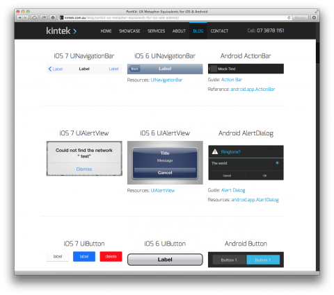
If you design apps for mobile devices, you will love PortKit. It shows you each Cocoa UI Element in iOS 6 and its Android 4 widget version, side by side, so you can compare them easily and find the correct equivalent when porting an app.
Wow! What an amazing resource. And what a wonderful generous spirit of the Kintek folks to share it all.
(via Khoi)
Is Mercury In Retrograde?

Is Mercury in Retrograde is a question I asked myself a lot last week. Now I know. Considering just how much went wrong during my trip to Switzerland, I am not surprised the answer is currently YES.
Don’t know what it means, when Mercury is in retrograde? Read up here.
(via Sharon Lee)

Don’t Fear The Internet

Jessica Hische and Russ Maschmeyer are the masterminds behind Don’t Fear The Internet, a site that aims to teach basic HTML and CSS for non-web designers.
Through short tutorial videos, you’ll learn how to take a basic wordpress blog and manipulate the CSS, HTML (and even some PHP!) to match your aesthetic. You’ll feel empowered rather than crippled by the internet, and worst case scenario, you’ll at least end up having a better idea of how professional web designers turn your design dreams into a reality on screen.
WhatFont Bookmarklet

Do you ever visit a website and wonder what font they’re using? Yes? You’ll love this: WhatFont launched a bookmarklet that tells you what font is being used on text you hover over. This is crazy amazing! (Yup, I am *that* excited) Thank you WhatFont!
(via JasonSantaMaria)
A 1140px wide, 12 column grid

The 1140 grid fits perfectly into a 1280 monitor. On smaller monitors it becomes fluid and adapts to the width of the browser. Beyond a certain point it uses media queries to serve up a mobile version, which essentially stacks all the columns on top of each other so the flow of information still makes sense. Scrap 1024! Design once at 1140 for 1280, and with very little extra work, it will adapt itself to work on just about any monitor, even mobile.
Download a Photoshop template of the grid at 1140px here. It’s based on how it’s displayed in WebKit, so it’s actually 1133px, as all browsers round sub-pixels slightly differently.
Read more about the 1140px grid.
(via unmatchedstyle)
The Great Typekit Table

Finding a good Typekit font for long blocks of text is hard, but Sleepover has sifted through the Typekit library and pared it down to the following list according to two simple rules: first, the font had to have lower case, upper case, bold, italic, and bold italic; second, the font couldn’t be handwriting, script, or monospace. If you think they’ve missed something, or made any mistakes, send a note to [email protected].
(via unmatchedstyle)
HTML5
HTML5 is…NOW! – Jason Beaird from Jason Beaird on Vimeo.
Jason Beaird, User Experience Designer at Mailchimp gave this interesting presentation on HTML5 at a Columbia Rrefresh Meetup. Watch the video above and read the interesting post over at Unmatchedstyle.
The Evolution of the Hyperlink
The NYTimes recently introduced a new feature that allows users to link to and highlight individual sentences and paragraphs in its web stories. I am impressed!
I agree with Courtney Boyd Myers: While it could be a tad complicated for an average reader, it’s a great tool for writers and bloggers who frequently link to NYTimes stories.
Here’s how it works. Take the base URL: http://www.nytimes.com/2010/12/01/world/americas/01colombia.html
To link to a specific paragraph, simply add a “#” and the number of the paragraph, e.g.: http://www.nytimes.com/2010/12/01/world/americas/01colombia.html#p2
To go a step deeper and skip to a particular sentence, try e.g.: http://www.nytimes.com/2010/12/01/world/americas/01colombia.html#p2s2
And where it gets really gets cool: To highlight that section, simply switch the p to an h. e.g.: http://www.nytimes.com/2010/12/01/world/americas/01colombia.html#h2s2

To simplify things, if you hit your shift key twice on a Times story, small icons appear next to every paragraph. Click on one of them and it’ll place the paragraph linked URL up in the address bar of your browser.

Read the full article over on TheNextWeb: The New York Times Introduces The Evolution of the Hyperlink, by Courtney Boyd Myers.
Hopefully more sites will adopt this feature. Hat tip, NYTimes!
(via @davidbauer)
Pad Pressed
PadPressed is a WordPress plug-in built to deliver the best browsing experience for your readers on an iPad. When a reader visits your blog from their iPad it is automatically formatted to be tablet ready with swipe to advance gestures, accelerometer aware column formatting, touch navigation, and more. PadPressed makes your blog function like a native iPad app. Click here to check out a demo.
(via @smashingmag)
Wazala

Tired of selling your products on someone else’s platform and your visitors leaving your site? Have you been toying with the idea of adding a shop to your website but then never got around to do it as the endeavour seems too daunting? Yup? Same here.
Well, I have come across a fantastic new service called Wazala which lets you add a “store” button to your blog or website, and your store will simply pop-up over your content — no more sending your customers elsewhere to make a purchase. Wazala functions as a part of your existing site. An elegant overlay will dim the background and light up the store to allow for a compatible look with your existing site design.
With Wazala you can sell hard goods and digital products. You can sell pictures, designs or music. You can even define different digital downloads for different product options. e.g. Hi Res, Low Res.
If you need to track inventory you can with Wazala’s simple and straight forward inventory management options. They can also alert you when you are getting low on certain products.
They really thought of everything as you can also create coupons for store wide, category or specific product use. Set expiration dates or limit number of uses. Its your call.
Wazala is integrated with Paypal and Google Checkout the two most widely used payment platforms for accepting credit cards and online payment for stores and ecommerce platforms.
Ready to try it out?
Wazala is currently in private beta. Use “BVF8KHC4QN” and it will allow you to sign up to any of the packages offered online during the closed beta.


HTML 5 for Web Designers

A List Apart just launched HTML5 for Web Designers. The HTML5 spec is 900 pages and hard to read. HTML5 for Web Designers is 85 pages and fun to read. Easy choice!
HTML5 is the longest HTML specification ever written. It is also the most powerful, and in some ways, the most confusing. What do accessible, content-focused standards-based web designers and front-end developers need to know? And how can we harness the power of HTML5 in today’s browsers? Jeremy Keith cuts to the chase, with crisp, clear, practical examples, and his patented twinkle and charm.
When is the iPad version going to become available, Jeffrey, Jason?
Baseline

Baseline is a designer framework by ProjetUrbain.com. Built with typographic standards in mind, Baseline makes it easy to develop a website with a pleasing grid and good typography. Baseline starts with several files to reset the browser’s default behavior, build a basic typographic layout — including style for HTML forms and new HTML 5 elements — and build a simple grid system. Baseline was born to be a quick way to prototype a website and grew up to become a full typographic framework for the web using “real” baseline grid as it’s foundation.
(via @mullerbrockman)
Cufón – sIFR alternative
Cufón aims to become a worthy alternative to sIFR, which despite its merits still remains painfully tricky to set up and use. To achieve this ambitious goal the following requirements were set:
1. No plug-ins required – it can only use features natively supported by the client
2. Compatibility – it has to work on every major browser on the market
3. Ease of use – no or near-zero configuration needed for standard use cases
4. Speed – it has to be fast, even for sufficiently large amounts of text
Cufon: Fast text replacement with canvas and VML – no Flash or images required.
(via twittering jason santa maria)
Return of the Mobile Style Sheet
If you’re just getting started with mobile design, you may face a number of hurdles, including the cost or technical challenge of designing and maintaining a second site—or a simple lack of understanding of how people on the go might use your site. This article discusses a first step toward mobile design that uses CSS to maximize interoperability across platforms. By starting simple, you can provide a decent initial experience, solicit user feedback, and iterate toward a more mobile-friendly design. This is the approach we are taking in our redesign of the W3C site.
Return of the Mobile Style Sheet, by Dominik Dominique Hazaël-Massieux
Email Standards Project

The Email Standards Project is about working with email client developers and the design community to improve web standards support and accessibility in email. The project was formed out of frustration with the inconsistent rendering of HTML emails in major email clients.
960 grid system

The 960 Grid System, by Nathan Smith, is an effort to streamline web development workflow by providing commonly used dimensions, based on a width of 960 pixels. There are two variants: 12 and 16 columns, which can be used separately or in tandem.
The 12 column grid is divided into portions that are 60 pixels wide. The 16 column grid consists of 40 pixel increments. Each column has 10 pixels of margin on the left and right, which create 20 pixel wide gutters between columns.
All modern monitors support at least 1024 × 768 pixel resolution. 960 is divisible by 2, 3, 4, 5, 6, 8, 10, 12, 15, 16, 20, 24, 30, 32, 40, 48, 60, 64, 80, 96, 120, 160, 192, 240, 320 and 480. This makes it a highly flexible base number to work with.
Download (180 KB) ( Zip contains PDF grid paper, templates for Fireworks, OmniGraffle, Photoshop & Visio, and CSS framework with demo HTML.
(via twittering cameron moll)
Taking the Plunge: Learning CSS
If you’ve been thinking of learning CSS but have become lost in the seemingly endless number of CSS tutorials that exist, you may want to read on. Webchicklet has compiled her favorite CSS-related sites that specifically help the CSS newbie grasp the essential concepts.
Taking the Plunge: Learning CSS
(via alceste)
patterntap.com | organized UI inspiration

Pattern Tap is Organized UI inspiration. Fantastic.
‘blow up’ your flickr photos

Blow Up is a Flash-based Flickr viewer that shows your photos in a full screen display. Just drop your Flickr name and go. You can also get your own Blow Up to run on your site or blog. If you can update CSS, you can easily customize the Blow Up interface and color palette. Fantastic!
(via always fabulous basement)