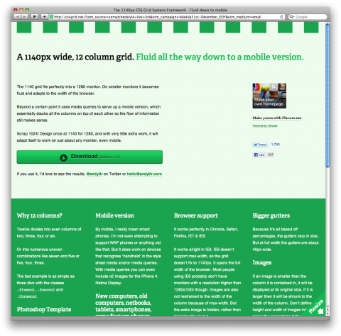
The 1140 grid fits perfectly into a 1280 monitor. On smaller monitors it becomes fluid and adapts to the width of the browser. Beyond a certain point it uses media queries to serve up a mobile version, which essentially stacks all the columns on top of each other so the flow of information still makes sense. Scrap 1024! Design once at 1140 for 1280, and with very little extra work, it will adapt itself to work on just about any monitor, even mobile.
Download a Photoshop template of the grid at 1140px here. It’s based on how it’s displayed in WebKit, so it’s actually 1133px, as all browsers round sub-pixels slightly differently.
Read more about the 1140px grid.
(via unmatchedstyle)

awesome!
i was thinking about playing with the Less Framework ( http://lessframework.com/ ) but seems much more minimal.
thanks!
Dec 18th, 2010 / 2:51 pm
This is nice. And would be interesting to build a WP template using it.
Dec 18th, 2010 / 3:29 pm
Agree with the comment above! You could definitely make some amazing templates/layouts with this grid. Definitely a must have :)
nickhammonddesign.blogspot.com
Dec 18th, 2010 / 6:38 pm
Thanks for sharing. Definitely has WordPress potential.
Dec 19th, 2010 / 11:37 pm
Thanks for sharing. It look good! i like it!
Dec 20th, 2010 / 5:06 am
looks nice, I’ve been trying it and it’s broken. Even from example file is wrong.
Dec 20th, 2010 / 5:11 pm
looks nice, I’ve been trying it and it’s broken. Even from example file is wrong.
Dec 23rd, 2010 / 2:37 pm
I would recoment 960 Grid System (http://960.gs/). make it easier for small resolution screens and works pretty good in large resolutions as well.
Jan 18th, 2011 / 7:07 am
currently implementing on several WP sites. Will try to remember to come back and share here when done. its an excellent grid and it works flawlessly thus far!
Apr 19th, 2011 / 4:21 pm
Problem with this solution is that you cannot mix and match different column-sizes because of the percentages.
Apr 24th, 2011 / 1:30 pm
theres no photoshop template for the 1140 grid on this link anymore…
Oct 26th, 2011 / 11:24 am