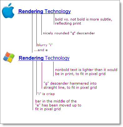
Apple and Microsoft have always disagreed in how to display fonts on computer displays. Today, both companies are using sub-pixel rendering to coax sharper-looking fonts out of typical low resolution screens. Where they differ is in philosophy.
Apple generally believes that the goal of the algorithm should be to preserve the design of the typeface as much as possible, even at the cost of a little bit of blurriness.
Microsoft generally believes that the shape of each letter should be hammered into pixel boundaries to prevent blur and improve readability, even at the cost of not being true to the typeface.
….
read full article, by Joel Spolsky, a software developer in New York City

(thank you larry)
I always wondered what it was that made my eyeballs want to jump out of my head when looking at a PC. Not only does it look wrong – and it is – it is also very harsh on the eyes.
Apple is doing the PC guys a real favor here with Safari. 1 less reason to switch to the Mac. A gazillion to go…
Jun 25th, 2007 / 5:16 pm
Actually, Safari font rendering is badly flawed: white text on dark background looks way bolder than it should. It is a known error and people started to develop hacks and workarounds..
http://24ways.org/2006/knockout-type
Jun 26th, 2007 / 4:36 am
I use Windows, Mac and Ubuntu Linux daily. Windows fonts (with ClearType active) are more readable on screen where Mac fonts are more similar to the print output and appear blurry on screen. When I have to read long texts I use Windows. Ubuntu Linux can be customized at your need: however my current settings (FreeType library-best shapes) are very similar to the Mac font rendering, probably superior.
Jun 26th, 2007 / 7:01 am
I don’t think Mac fonts are too blurry.
Why isn’t anybody mentioning that Internet Explorer 7 comes with a very strong font smoothing and anti-aliasing system? And it is really blurry, just like ClearType has always been on Windows. I’ve used Microsoft’s OSs for years, and I’ve always thought that with ClearType on fonts were too blurry, while with ClearType off fonts were too sharp. I never thought either of the two solutions was good actually, and I found the new IE rendering (possibly even blurrier than ClearType?) really frustrating.
Then last year I got my first Mac. And from the very first moment I felt that finally fonts were just great. Not sharp, not blurry, just as they are meant to be.
(this mess of a post to say that it’s not a question of being used to something like the author of the article says, IMO fonts on Macs are great, fonts on Windows aren’t)
Jul 10th, 2007 / 5:08 pm
I think it would be as easy as this, in every OS: “You want to read from screen? click on screen-optimized view.
You want to print this text? click on printer-view”
Is their problem (win, mac, linux and every other) to figure out what is best for reading from the screen and what is most accurate at reflecting how’s gonna be in the paper.
Also, we have the FONT problems. It’s a known fact that Arial (Windows) is a bad copy of Helvetica (Mac) and that should be considered as well. In this website I found this: no compatibility? :P
Bye
Nov 15th, 2007 / 10:21 am
Sorry, the last part was erased I think because I copy-pasted css code, it said that in the css of this site the font family defined is Arial. :P
Nov 15th, 2007 / 10:41 am