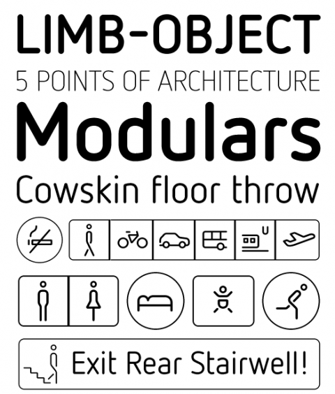
With FF Netto, Daniel Utz has stripped letters of any historical detail, leaving them with the barest, clearest forms possible. This makes FF Netto ideal for wayfinding, where quick recognition is essential. A series of simple and useful icons and arrows add to its utility for information design, and intelligent borders let you group the pictograms using just a few keystrokes.

I saw this and thought: Is it really clearer than a geometric sans like Helvetica? In my opinion it isn’t..the lowercase ‘t’ for example seems more difficult to read.
Aug 19th, 2008 / 3:54 pm
ahem, I mean grotesque sans.
Aug 19th, 2008 / 3:56 pm
I love this. It reminds me of the beautiful work Toan Vu-Huu did for the Cologne Bonn Airport.
http://www.toanvuhuu.com/projects/cologne-bonn-airport/
http://www.airport-cgn.de
Aug 19th, 2008 / 4:56 pm
Why would FF Netto be any more recognizable than Helvetica, Frutiger, or other sans serif and serif type faces? FF Netto might be useful for a wayfinding sign system it’s a bit removed from what we are used to seeing and reading and such that it might in fact not be a good typeface for a sign program. And while those icons and arrows are kind of quite and fun they are NOT standard DOT symbols and if used in an airport where people really do need to read signs quickly they could cause confusion. Besides, it always bugs me when women symbols have only one leg, unless they really do. Like all typefaces they have their time and place and good usage but to claim that it is ideal for wayfinding is a presumptuous statement by someone who really doesn’t know what they are talking about. And I doubt that I would use it so.
Aug 19th, 2008 / 7:10 pm
@scott: the DOT is not the world. If another country wants to use this font for signage or wayfinding is perfectly fine. Your attitude is presumptuous and shows a hint of someone who also doesn’t know what he/she is talking about.
Aug 21st, 2008 / 5:39 pm