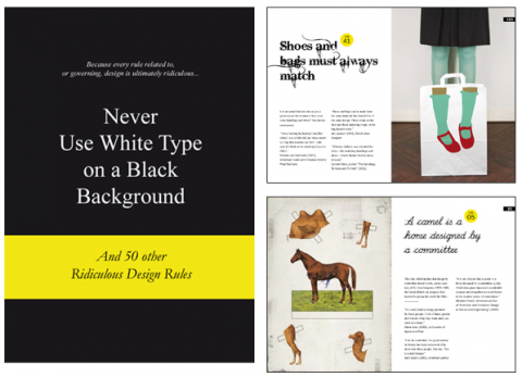
Design has many rules that claim to be big truths and full of wisdom. Designers all go by rules that work for them. However, their rules may not work for someone else, or for a particular piece of design work. When a rule is forced upon you, it stops working and becomes a joke, like “Never use a PC,” or “Leave it until the last minute,” or the most famous of them all, “Less is more.”
The problem is that every rule related to, or governing, design is ultimately ridiculous. In this book we have collected the most talked-about rules and the viewpoints of designers and thought leaders who live by them or hate them..
Never Use White Type on a Black Background: And 50 Other Ridiculous Design Rules

My wife’s always quoting me crap like this… I’m getting a copy!
Jun 11th, 2009 / 10:47 pm
Here’s one.
Never use Times New Roman as a display face (fail).
Never haphazardly capitalize Word For No Good Reason, even if they’re Not Proper Nouns.
I’ll tell you what … I’d take a book like this a lot more seriously if, in excusing mediocre designers from following guidelines that could seriously improve their work, it itself was well-designed.
But it’s not. And unless you’re certain you know what you’re doing, you could do far worse than following rules like these (although some of them, I think, were made up just for the sake of this book’s breaking them – several are things I’ve never even heard of, and are just plain silly).
Jun 14th, 2009 / 2:43 am