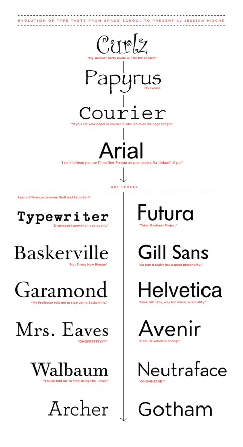
Thank you for procrastinating, Jessica, and sharing this Evolution of Type Taste Chart from Grade School to present with us here in the studio! I am glad to see I was not the only one going through a Courier and Typewriter phase. (Please note this is Jessica’s personal evolution of Type Taste.)

Too funny! I can definitely relate to this evolution. I remember using Comic Sans a really really really long time ago and I thought it was the coolest thing ever!
Feb 5th, 2010 / 4:50 pm
oh, gosh, this reminds me of a cheezy but very funny video about these standard typefaces (one of those things I was sort of embarrassed to admit I enjoyed). Check out http://www.collegehumor.com/video:1823766. Don’t Judge!
Feb 5th, 2010 / 5:35 pm
Haha, this is friggin hilarious! I guess all roads lead to Gotham, huh? Good to know.
Feb 5th, 2010 / 5:39 pm
I love it. What if I am still in they typewriter phase?
Feb 5th, 2010 / 6:30 pm
Whoops, I guess I need to go back to using a typewriter, since I can’t spell so good.
Feb 5th, 2010 / 6:32 pm
niceeee
Feb 5th, 2010 / 11:34 pm
This is creepily accurate for me (minus the papyrus).
Especially with Gotham & Archer
Feb 6th, 2010 / 5:26 am
Interesting that the pinnacle of both lines are fonts from Hoefler & Frere-Jones.
Feb 6th, 2010 / 12:00 pm
OMG! SO funny!
As a designer (and girl) the ‘female’ slumber party thing is a hoot! As a mother, I’ve definitely overheard the Courier argument. (My kids have LOTS of font access!)
Thanks for the humor. ;-)
Feb 6th, 2010 / 12:15 pm
Me from 2003 (I was 8) to the present.
Feb 6th, 2010 / 7:14 pm
I’m going through a courier phase too! -> shaunfox.com
Feb 8th, 2010 / 12:13 am
Hee! I think my lineage is similar. Made me laugh!
Feb 16th, 2010 / 12:13 am
H&FJ!!!!
Feb 26th, 2010 / 10:08 am