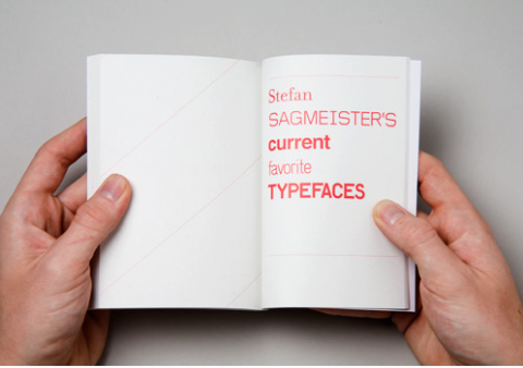
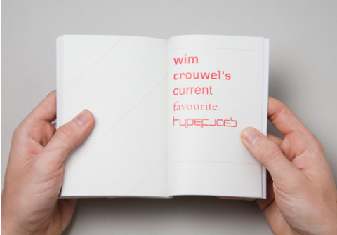
Create/Reject asked 50 leading designers about their current favorite typefaces. What a lovely book idea. Too bad it’s sold out! Would have loved to get my hands on one of these! Lovely to know that the coverprice all went to UNICEF!
What typeface would you have picked?


Currently loving Eurostile. Clean, modern, lovely.
Jul 8th, 2008 / 8:31 am
I’m into Coolvetica at the moment.
Jul 8th, 2008 / 9:20 am
Can’t get enough of Clarendon at the moment!
Jul 8th, 2008 / 9:38 am
I’m so fickle….bold all caps one minute and the next is lower case scripts.
Jul 8th, 2008 / 10:11 am
Univers
Thesis (serif and sans)
Trade Gothic
Helvetica (the whole family)
Lubalin Graph (or some such slab serif)
Futura
Avenir
Bookman Complete (love the swash, seldom use it)
Silkscreen
Jul 8th, 2008 / 11:05 am
I actually ordered this!
Font of the moment: Perpetua
Font of my life: Adobe Caslon Pro
Foundry I can’t live without: Emigre
Jul 8th, 2008 / 11:15 am
Really into Klavika right now, and been itching to use Archer since it was released.
Jul 8th, 2008 / 11:34 am
Avenir
Boris Black Bloxx
CG Gothic #3
Tanek
Jul 8th, 2008 / 2:21 pm
I use ITC Bradley Hand a lot; designed by Richard Bradley.
Jul 8th, 2008 / 2:28 pm
Using a lot of Avenir, Gotham, Scala Sans, and Kievit at the moment. Looking forward to having an excuse to use Variable soon.
Jul 8th, 2008 / 3:14 pm
House Industries — Luxury
Hoefler Frere Jones — Archer
Hoefler Frere Jones — Gotham
Hoefler Frere Jones — Mercury
Dalton Maag — Foco
Avenir
Really looking forward to Bolda Display release! How are you enjoying Switzerland? We just moved from Schaffhausen back to the U.S. and we miss it!
Jul 8th, 2008 / 4:16 pm
i had to go do a font search for some of these but my favorite is the old school look of courier – visualizing someone pecking away on the keys of an old typewriter. also the really distressed courier is cool
Jul 8th, 2008 / 5:33 pm
Trade Gothic and Franklin Gothic. Always and forever . . . . the ‘g’s and the ‘a’s are the best.
And also Sabon for body text.
And sometimes Helvetica Ultra Light when I’m feeling classy.
Jul 8th, 2008 / 10:34 pm
New font: FF Tisa. A simple, clean little serif. Unassuming, but bold.
Classic font: Can’t go wrong with Futura.
Stand-by font: Always had a little something for Mrs. Eaves.
Jul 9th, 2008 / 9:22 am
Bryant from Process is still rockin’ my world after Clarendon went frigid on me, revealing me for the two.point.ho that I am.
Jul 9th, 2008 / 10:02 am