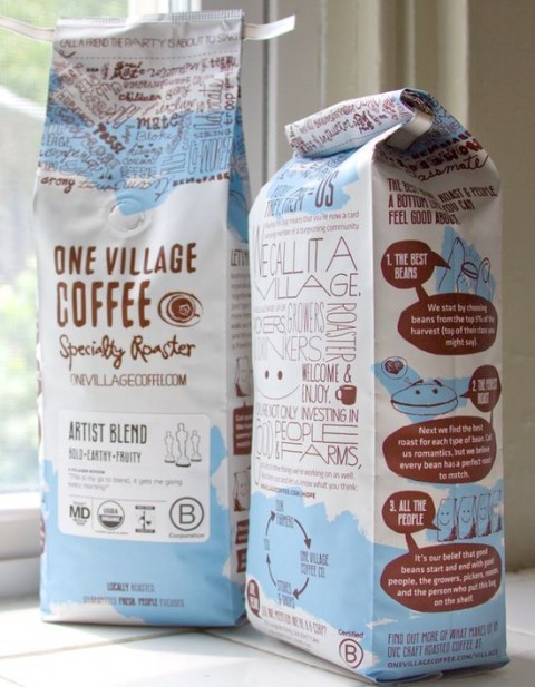
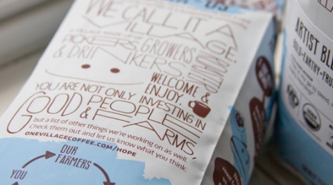
Greg of Able pointed to one of their most recent projects, a Coffee Packaging design: “One of our goals was to package the sentiments of “a village” into a customer experience. The bag was printed in white + two colors with a matte finish and gloss trapping over the logo. Because the budget didn’t allow for more than one type of bag, a different label with a customized icon is used to identify each type of coffee.”
Lovely. Made me smile and I’d definitely gravitate towards this packaging would I peruse a coffee shelf in a supermarket.
More photos over at thedieline.com.


Seems like this time I have to disagree with you. I find this design too sloppy. It looks like something already seen and it has too much visual information. I would definitely take some layers out of this thick onion.
Jun 28th, 2010 / 11:32 am
Great color palette! Nice typography, too.
Jun 28th, 2010 / 10:10 pm
i disagree maria. imagine the bags on a grocery store shelf. all you would see is the logo and the label, and maybe just enough of the typography at the top of the bag to wonder what you were missing. i think i would definitely want to pick up the bag to find out more.
Jun 28th, 2010 / 11:52 pm
beautiful! i wont care about the coffee inside, i’ll buy cause of the packaging
Jun 29th, 2010 / 11:19 am
I’m with Maria. While the general first glance looks great, the logo is completely lost in there. It almost looks like someone redesigned the packaging, but ran out of time and left the logo as it was from some previous designer.
Apr 7th, 2011 / 10:49 am