Minority Report science adviser and inventor John Underkoffler demos g-speak — the real-life version of the film’s eye-popping, tai chi-meets-cyberspace computer interface. Is this how tomorrow’s computers will be controlled? WOOOOW!
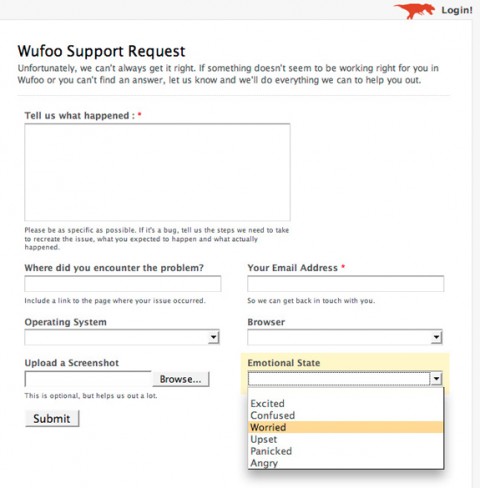
Surprising UI: Huffduffer Sign Up Screen
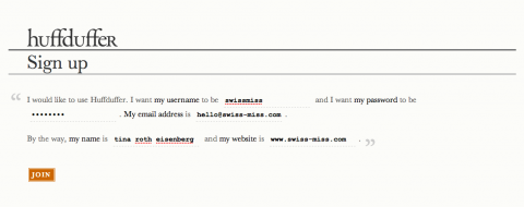
Huffduffer has the most surprising and refreshing sign up screen I have yet seen. Thumbs up! Made me look!
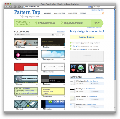
patterntap.com | organized UI inspiration
Pattern Tap is Organized UI inspiration. Fantastic.
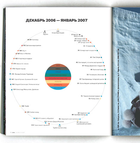
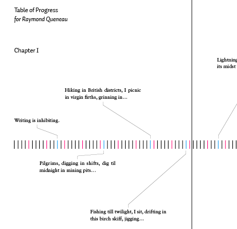
Table of Contents: Creative Examples
Table of contents is often considered to be one of the most unspectacular design elements ever invented. Because of its simple, usual form, table of contents is often not given the attention it may deserve — after all, it is just a list of the parts of a book or document organized in the order in which the parts appear. But why not use exactly that and surprise the reader of a booklet, brochure, annual report or a book with some beautiful and original table of contents? In fact, many creative approaches are possible. Table of Contents: Creative Examples
(thank you jon)
Smoothly navigate and analyze the most recent Democratic Debate
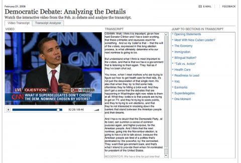
Michael pointed me to this page on the New York Times that has some fantastic functionality in terms of how you navigate through the most recent Democratic Debate. Click on any place in the copy and you’ll be taken to that part in the debate. Or click on a topic. Hat tip to the New York Times team. Fanastic usabilty and interface design!
ratings: color bars instead of stars
Summize, a price comparison site, offers a new way of displaying ratings: colored bars, which summarize the reviews : the more green, the more positive they are. Where stars only give an average rating, those color bars really add some depth to the information. And I love how their rating system is graphically reflected in their fav-icon.
I agree wth David Abbet: Simple, elegant, useful.
