Typefaces of the World

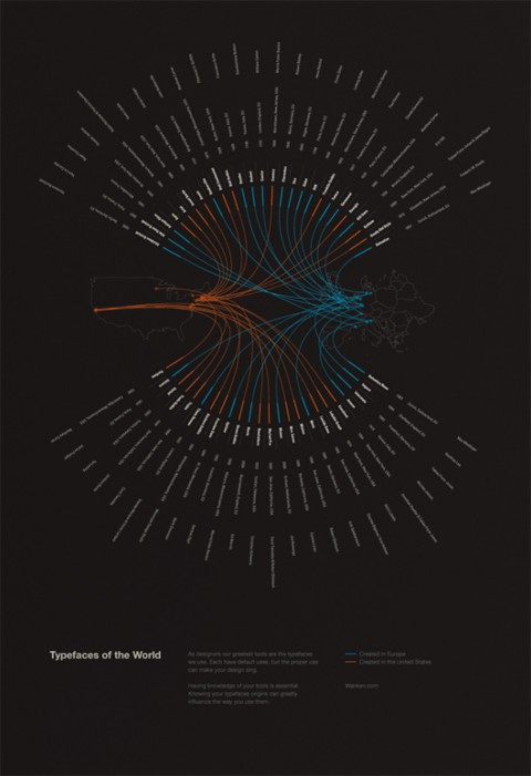
Typefaces of the World is a poster Shelby White created to show the typefaces that are most commonly used in a lot of today’s design. The poster includes information for each typefaces such as the year it was made, the location and the typographer. These 50 typefaces were chosen based on popularity and usefulness in present design. It was by mere coincidence that the typefaces were nearly split 50/50 between Europe and the United States. But it does show that the most prominent locations for typographers were in these areas.

What a beauty! I would love to hang one of these in my studio. Shelby says he is toying with the idea of adding a store to his site. Let’s hope he does soon! Typefaces of the World! Wishlisted!

Should I work for free Flowchart

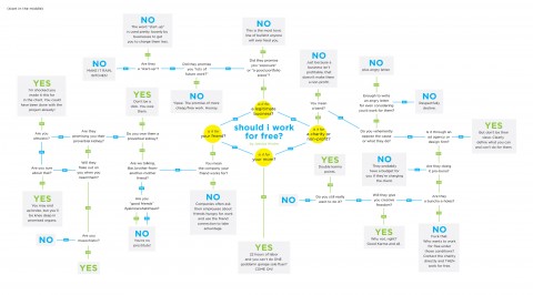
My former studiomate Jessica Hische put together this flowchart answering the question “Should I work for free?

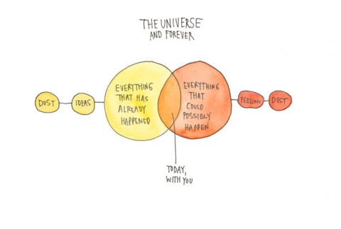
The Universe and Forever


Today’s 20×200 edition by Wendy MacNaughton made me smile: The Universe and Forever.

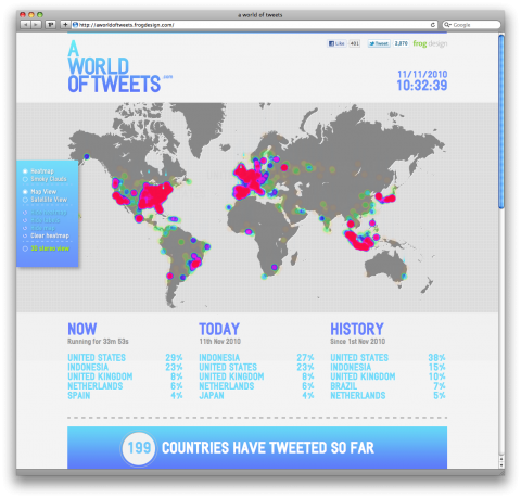
A world of tweets

A World of Tweets shows you with a heat map visualization where people are tweeting at from the past hour. The more tweets there are from a specific region, the “hotter” or redder it becomes. This continuous collection of Twitter statuses shows in what an incredible tweeting world we live in. Check out the 3D view!

A project by Frog Design.

(thank you fabulous John Ford)

Lunchguest: David McCandless

Today, I am finally starting the long overdue “LunchGuest” category here on swissmiss. We often have interesting, smart people come visit Studiomates (our studio collective) and we’ve been talking for a while that we should simply start a digital guestbook of all the fantastic people that stop by.

Today’s studio lunchtable was more than packed: Studiomates were excited to meet and lunch with David McCandless, force behind Information Is Beautiful and this amazing TED Talk by David called The beauty of Data Visualization.

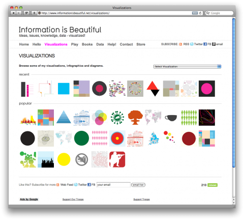
David McCandless is a London-based author, writer and designer. He’s written for The Guardian, Wired and others. These days he’s an independent data journalist and information designer. A passion of his is visualizing information – facts, data, ideas, subjects, issues, statistics, questions – all with the minimum of words. He’s interested in how designed information can help us understand the world, cut through BS and reveal the hidden connections, patterns and stories underneath. Or, failing that, it can just look cool!

More about David:

– A book of his information designs is published by HarperCollins in the US and UK in 2009.
– In the past, he has worked as a journalist, video games writer, satirist, copywriter, and creative director. His personal site.
– Check out his Google Shared Items scrapbook (Be warned: it’s mostly funny viral chaff and bizarro pictures)

Here’s David McCandless virtual Guestbook entry on our studio-ideapaint wall (link to view large)
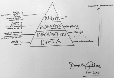
It was great to have you, David!
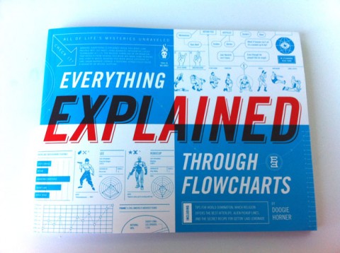
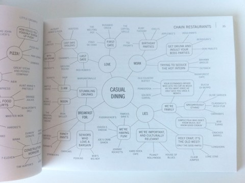
Everything Explained Through Flowcharts

How is the world going to end? What’s the best way to win an argument? Which heavy metal band name is right for you? Learn the answers to these questions by reading Everything Explained Through Flowcharts by Doogie Horner.

Journalism in the Age of Data

Journalism in the Age of Data from geoff mcghee on Vimeo.

If you have a spare hour, then feast your eyes on Geoff McGhee’s video documentary “Journalism in the Age of Data,” which explores the exciting potential and occasional pitfalls of modern data visualization.

(via GOOD)

The beauty of data visualization

David McCandless shows how design can make sense out of the overwhelming amount of information in today’s world. He turns complex data sets (like worldwide military spending, media buzz, Facebook status updates) into beautiful, simple diagrams that tease out unseen patterns and connections. Good design, he suggests, is the best way to navigate information glut — and it may just change the way we see the world.

The illustrated guide to a Ph.D.

Matt Might, Assistant Professor at the School of Computing University in Utah, explains to a fresh batch of Ph.D. students what a Ph.D. is.

It’s hard to describe it in words, so he uses pictures.

The illustrated guide to a Ph.D. (also as a PDF)

(via @sandbox_network)

The Four Seasons Visualized

Laia Clos’ studio mot designed this data visualization of The Four Seasons by Antonio Vivaldi. lesquatrestacions is a graphic information system for visualizing the lead violin of Vivaldi’s masterpiece. The work consists of four posters, a set of stamps and the documentation of the system.

(via datavisualization.ch)

Storytelling visualized

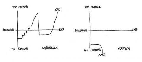
Kurt Vonnegut explains storytelling through Cartesian graphs on a blackboard. Read the Article: Kurt Vonnegut at the Blackboard

(via @brainpicker)

Hipster Fashion Cycle

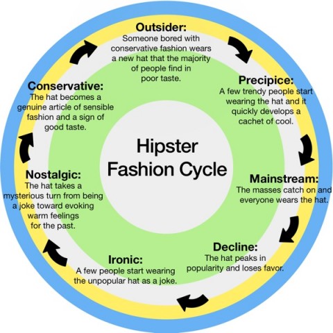
Hipster Fashion Cycle Infographic designed by Emily Miethner.

(via thinkingaloud)

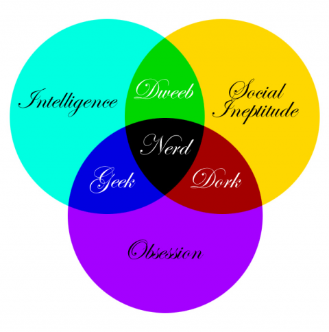
What are you?

Made me chuckle. Couldn’t make up my mind yet which category I belong to. (Tempted to redo this graphic with a less painful font choice)

Found this over on Red’s photostream. Can anyone point me to the original source so I can give proper credit?

Where Americans Are Moving

More than 10 million Americans moved from one county to another during 2008. The map below visualizes those moves. Click on map to be taken over to Forbes.com and then click on any county to see comings and goings: black lines indicate net inward movement, red lines net outward movement.

Where Americans Are Moving.

(via JayParkinson)

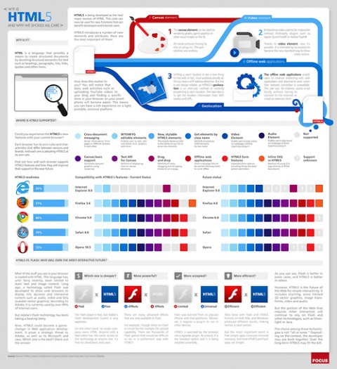
What is HTML5?


What is HTML5 and why should we all care? See the large version here.

(via @datavis)

daily stack


Daily Stack’ is a visual time management tool created by designers Sebastian Rønde Thielke and Anders Højmose. It allows users to help visually track their work flow by creating physical representations of their tasks. Smart and playful!

(thank you keren)

New Webtrend Map

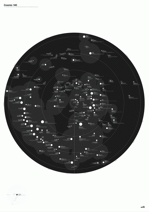
InformationArchitects did it again, here it is, their next Web Trend Map. No Metro lines, no URLS. This time, it’s the 140 most influential people on twitter, sorted by #name #handle #category #influence #activity. Plus: When they started tweeting and what they first said. (Yikes, I am on it and my first tweet wasn’t deep, was it? “Trying to get my ladies to tweet!”)

Cosmic 140, vailable as high quality A0 Poster for $99 or as a free PDF, so you can print it yourself

GE by Lisa Strausfeld

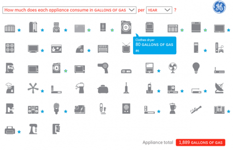
Lisa Strausfeld of Pentagram has designed an interactive data visualization for GE, a calculator that converts energy consumption into accessible units like cupcakes baked, sitcoms watched, etc.

Learn more about the project over on Pentragrams blog.

Wheel of Nutrition

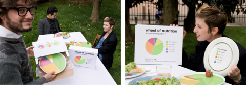
How clever is this Wheel of Nutrition plate, using visualization to support healthier eating habits. It was created by Hafsteinn Juliusson, Rui Pereira and Joana Pais.

(via brainpicker)

Comparing the 100 Largest Sites on the Internet

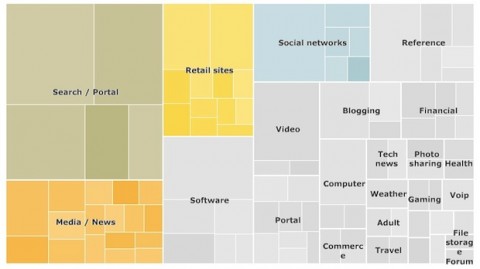
Infographic of the Day: Comparing the 100 Largest Sites on the Internet. What types of sites get the most traffic?

How to pick the right chart

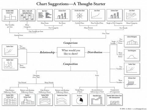
How to Pick the right Chart by Amit Agarwal on Flickr.

(via iA)

Google facts and figures (massive infographic)


Google facts and figures (massive infographic) by Pingdom.

(via ji lee)

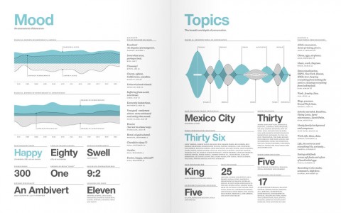
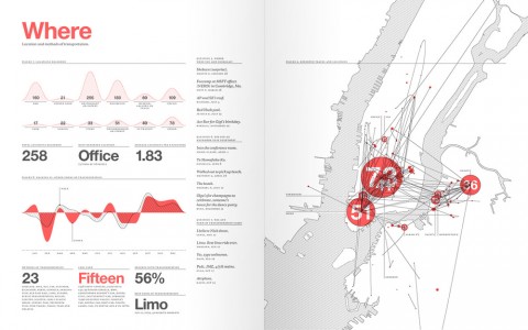
Feltron 2009 Annual Report

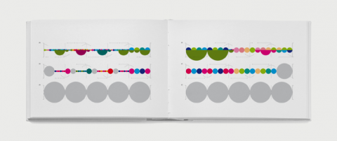
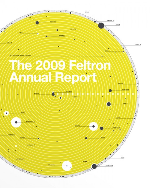
I don’t know how he does it, but Nicholas raised the bar again: the Feltron 2009 Annual report is out. To order a print edition of the 2009 report, click here. Hat tip off to Nicholas!

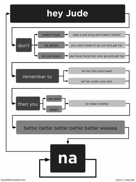
The Beatles, flowcharted

the beatles flowcharted

Originally uploaded by LoveAllThis.

(via bobulate / coudal)