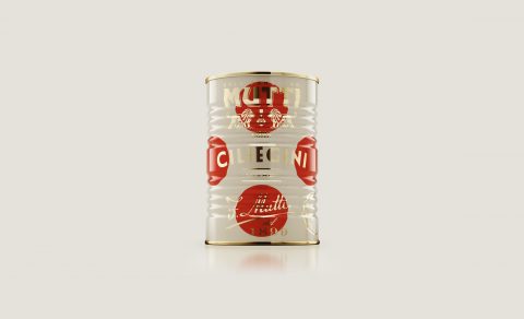
The Mutti Tomato Sauce Packaging is *stunning*.
(via Chris)
Every time I grab my MacBook and see our custom CreativeMornings tabtag, it puts a smile on my face. I am usually not someone that would E-V-E-R put a sticker on anything I own, but the concept of tabtags won me over: They are glowing (!) and reusable MacBook stickers. You can remove them without a trace and reuse them over and over. SO MUCH FUN!
Chose from their huge archive of designs or make your own.


I might be a little late to the game, so pardon if you have seen this before but I can’t stop smiling. The Santa Brand Book is one of the funniest branding spoofs I have come across. Ever. Hat tip to Quietroom for pulling off the Santa Brand Book.
Download the PDF here.
(Thank you James)


South Africa’s Kulula airlines recently received the rebranding treatment from creative agency Atmosphere when they applied this 101 guide to the various parts of the airplane. Made me smile. Found over at PSFK.

Using no ink whatsoever, these 18″x24″ posters are foil stamped and embossed to create an alphabet composed of letters from many of the more famous (and some infamous) logos of all time. Printed in two different colorways, you have the choice of silver foil on black paper or gold foil on cream, both stocks are 100 lb. French Pop-Tone and include the artist’s signature on back.
(via substudio)


This Sandwich Shop Identity made me chuckle. La Charcuterie is a deli/restaurant hybrid well-known around Vancouver for serving up sandwiches filled with deli meats. To play off this, business cards were created to look like cold cuts then were strung in netting similar to the way salami’s and other cured meats are hung in delis. Finally, Rethink printed meat stickers for the letterhead and envelopes made of butcher paper— the same paper they wrap their sandwiches in.

Stefan Kanchev (1915 – 2001) was one of the most prolific graphic designers to come out of Bulgaria. He’s designed numerous book covers, posters, postcards, advertisements, forms and envelopes, post stamps, labels and packages but he’s widely recognized for his excellent logo work. He’s considered one of the best logo designers along with Saul Bass and Paul Rand.
(via aisleone)

Saw this beautiful graphic underlining the power of consistency over at thinkingalaud.

The PepsiCo Americas Beverages division of PepsiCo is bowing to public demand and scrapping the changes made to a flagship product, Tropicana Pure Premium orange juice. Redesigned packaging that was introduced in early January is being discontinued, executives plan to announce on Monday, and the previous version will be brought back in the next month.
Also returning will be the longtime Tropicana brand symbol, an orange from which a straw protrudes. The symbol, meant to evoke fresh taste, had been supplanted on the new packages by a glass of orange juice.
Tropicana Discovers Some Buyers Are Passionate About Packaging, by Stuart Elliott.

The brilliant Culture Bus logo brings together the letters C and B in a form that resembles a route. Best.Logo.Ever. Hat tip to Kit Hinrichs, Pentagram.
(via subtraction)

Collection of vintage logos from a mid-70’s edition of the book World of Logotypes. (flickr set)
(via elihorne / via werunthestreets)

Dos Logos. Amazing contemporary logo design resource.

Anatomy of a Merger, by Giampietro+Smith
The version of this article that was published on 15 September 2005 by BusinessWeek.com is available here.

“Future States,” a rebranding of the US by Paula Scher. Unfortunately, the Monocle print piece is (still) only available to subscribers, but there’s a video component, Brand America, an interview with Scher conducted by Tyler Brûlé. In it, she advocates trashing several visual icons of the USA brand, including the “America” portion of our name. Which is funny, since she designed the book on America.
(via the fabulous unbeige alissa)

Swisscom, the biggest Swiss telecom operator, will be launching a new brand identity: the new logo, which will be rolled out across fixnet, mobile and Internet services next spring, is the one at right. Check out the animated logo over on the custom rebranding website. While the new mark truly doesn’t do anything for me, I must say I enjoyed watching the history of the brand itself. Click on “Die Motivation”.
(via lunch over IP)


