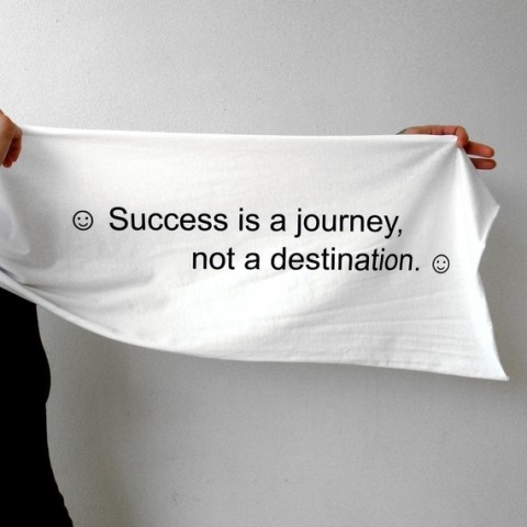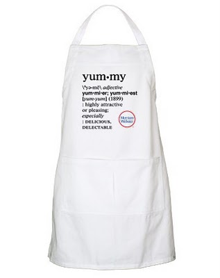
I completely agree with BBlinks, this apron from Merriam Webster is totally ‘adorkable’.
Yummy
Typefaces of the World
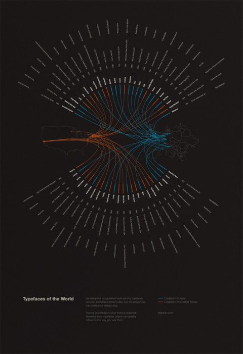
Typefaces of the World is a poster Shelby White created to show the typefaces that are most commonly used in a lot of today’s design. The poster includes information for each typefaces such as the year it was made, the location and the typographer. These 50 typefaces were chosen based on popularity and usefulness in present design. It was by mere coincidence that the typefaces were nearly split 50/50 between Europe and the United States. But it does show that the most prominent locations for typographers were in these areas.
What a beauty! I would love to hang one of these in my studio. Shelby says he is toying with the idea of adding a store to his site. Let’s hope he does soon! Typefaces of the World! Wishlisted!
SVA Masters Workshop: Summer 2011
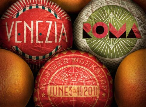
poster by Louise Fili Ltd
Now this makes me swoon, who wouldn’t want to study design & typography in Venice and Rome? The SVA Masters Workshop, now in its third season, is a unique way to learn about type, book and lettering design, as well as architecture, art, archeology and even Italian cuisine. Study with some of the best typographers in Italy. Visit the Trajan Column and the Pantheon, and partake in exclusive visits to the Roman and Imperial Forums. Examine the inscriptions on Roman structures that have long been accepted as a typographic ideal.
This intensive hands-on workshop in design history, theory and practice allows participants to research and analyze the roots of typography, draw type and letters from the classic models while practicing contemporary design along with a faculty of Italian and American designers, historians and publishers. Taught by leading design professionals, this workshop emphasizes the multidisciplinary and entrepreneurial nature of contemporary design. In addition, collaborations with noted Italian design organizations and media businesses result in unique (and potentially publishable) print and Web projects.
Check out the prestigious faculty and photos from previous years.
MoMA has acquired 23 digital fonts
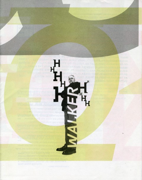
Matthew Carter’s Walker
The Museum of Modern Art has just acquired 23 digital typefaces for its Architecture and Design Collection. Some are of everyday use, like Verdana; others are familiar characters in our world, like Gotham, which was used in President Obama’s election campaign, or OCR-A, which we can find at the bottom of any product’s bar code; and others are still less common, but exquisitely resonant, like Walker or Template Gothic.
The fonts will be on view starting March 2 in MoMA’s Architecture and Design galleries, as part of a collection show entitled Standard Deviations; Prototypes, Archetypes, and Families in Contemporary Design.
Read more here.
(Thank you Paola)
Erosion and Typography 3
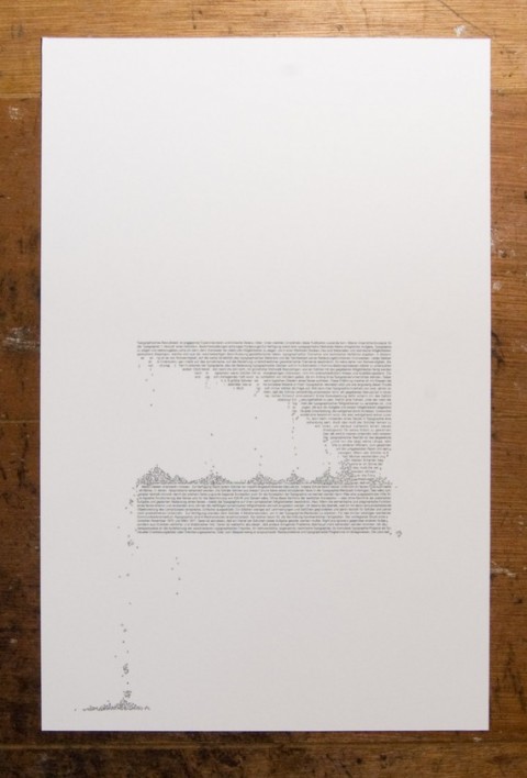
This typographic print is third in a series of three, each of which explores the effects of erosion and weathering on the printed word.
The text itself is taken from a 1971 essay on experimental typography by the German designer and typographer Wolfgang Weingart, and is set in the Univers typeface. Univers was designed from 1954-57 by Adrian Frutiger.
Stunning. #wishlisted
A to Z Magnatab
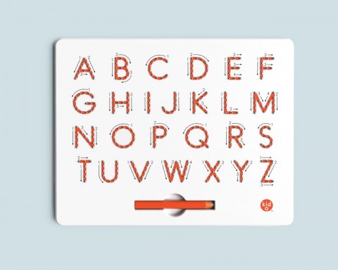
A to Z Magnatab helps your little one write his first letters via easy-to-follow arrows. A magnetic stylus pulls beads up to create solid lines. Erases with the tip of a finger.
Type Directors Club Competition
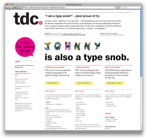
I’ve had the honor to be a judge in the Type Directors Club Competition in the past and am excited to see what this year’s competition will bring forward. If you’re a type snob and have created beautiful typography driven designs or even a typeface then don’t miss the Type Directors Club Competition Entry Deadline on January 12th!
Long Live Typography!
#matteomademedothis
Shut the front door
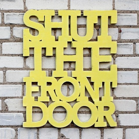
A typographic wall decor with a clear message: Shut the front door.
Giant Fortune Cookie Scarf
This Giant Fortune Cookie Scarf made me chuckle. I found it via the brand new TasteEtsy.
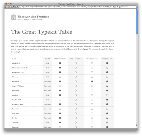
The Great Typekit Table
Finding a good Typekit font for long blocks of text is hard, but Sleepover has sifted through the Typekit library and pared it down to the following list according to two simple rules: first, the font had to have lower case, upper case, bold, italic, and bold italic; second, the font couldn’t be handwriting, script, or monospace. If you think they’ve missed something, or made any mistakes, send a note to [email protected].
(via unmatchedstyle)
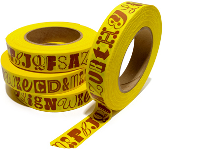
Alphabet Tape
House Industrie’s Alphabet tape gets my thumbs up. Take an ordinary object, put type on it and magically a smile appears on my face.
Letter Lights
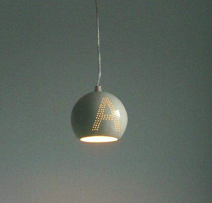
What is it with my obsession with typography-on-things? I can’t help it. How adorable are these letter lights?
They are handmade in Brooklyn by artist Amy Adams. Soft light peeks out of the tiny holes that make up each letter – just lovely! Choose a single letter to mark baby’s name or spell out any name or word (up to 6 letters) to create a bespoke chandelier.
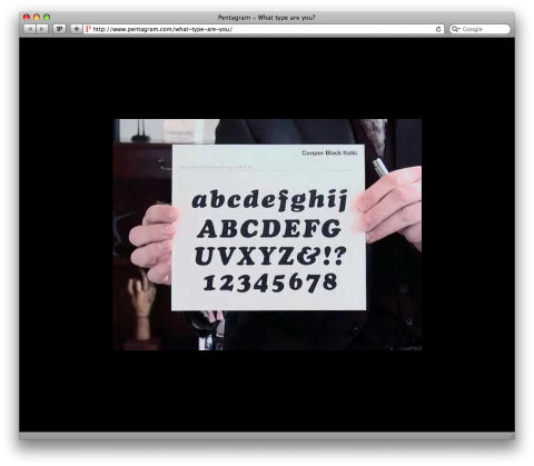
What Type are you?
Something tells you I am late to the game with Pentagram’s What Type Are You? But anyhow, it made me laugh! (I am Cooper Black Italic!)
(Thank you Markus!)
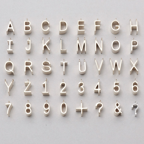
Jacqueline Rabun
This jewelry alphabet by Jacqueline Rabun makes my heart beat a little faster. (Yes I would go for the + or &.)
(via dezeen)
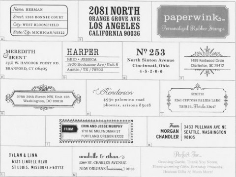
personalized rubber stamps
With the holidays rapidly approaching, these personalized rubber stamps seem like a fantastic idea (and gift). Oder them over at Paperwink.com. (I just ordered one of these for myself.)
(via makingitlovely)
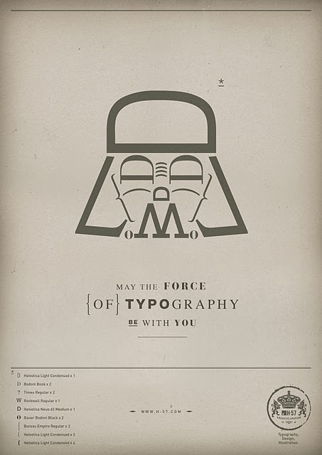
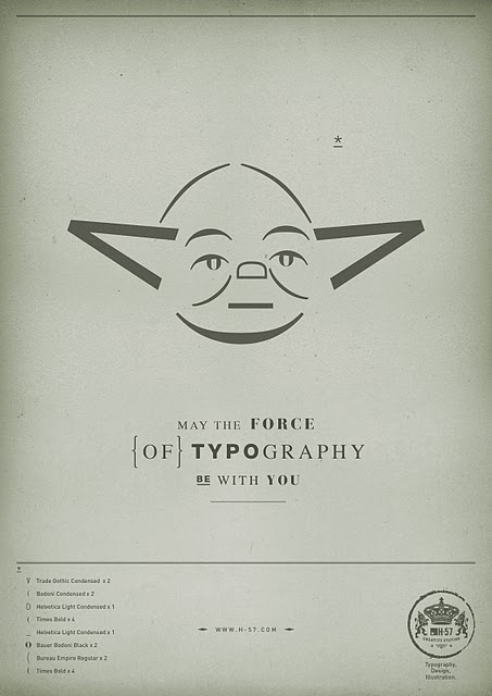
May the force of Typography be with you
May the force of Typography be with you. (I don’t know who to give credit to!?)
Illustrator CS5 Feature
You like to draw type? Jessica Hische style? Then you’ll love the below screencast Jessica did of a new Illustrator CS5 feature:
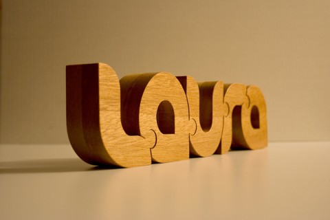
Nuzzles
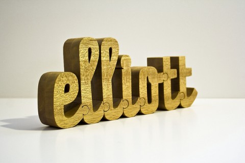
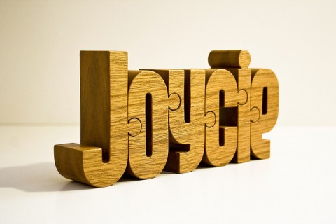
Nuzzles are custom designed wooden typographic puzzles handcrafted by John Christenson. Every Nuzzle is crafted from a single block of wood, and the characters interlock with each other in a way that creates a sense of harmony and integrity. Want one? YES!
(The word Nuzzle is awesome. I just want to keep saying it over and over. Nuzzle. Nuzzle. Nuzzle.)
(Thank you Katherine)
Good Morning/Good Night
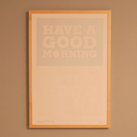
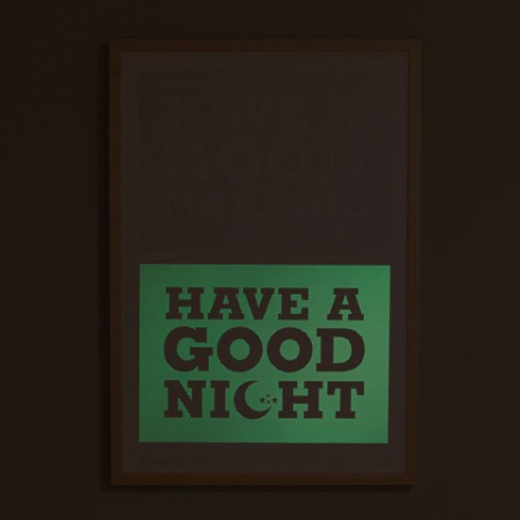
This limited edition Morning/Good Night letterpress poster features glow-on-the-dark ink. Lovely idea!
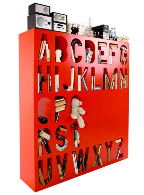
Alphabetic Bookshelf
This Alphabetic Bookshelf will certainly not win a price for being the most useful bookshelf out there, but it sure makes a typography lover like me happy.
