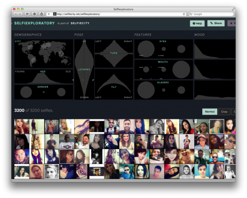
My life in weeks poster is a powerful visual reminder how short life is. Each box corresponds to one week in an average 88-year lifespan, and every filled-in box is one that you have already lived.
My life in weeks poster is a powerful visual reminder how short life is. Each box corresponds to one week in an average 88-year lifespan, and every filled-in box is one that you have already lived.
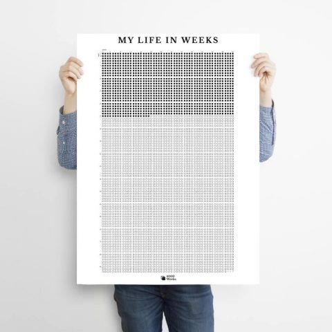
Thomas Rhiel created this stunning, colorful map of all of Brooklyn’s 320,000+ buildings. He plotted and shaded each of them according to its year of construction. The result is a snapshot of Brooklyn’s evolution, revealing how development has rippled across certain neighborhoods while leaving some pockets unchanged for decades, even centuries.
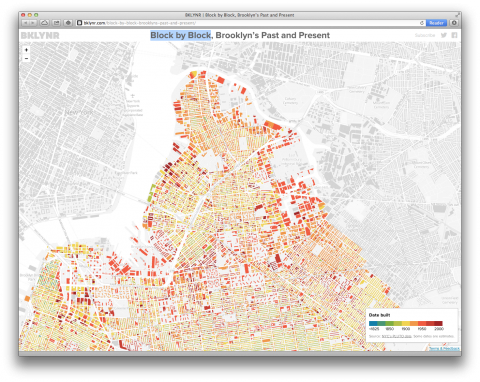
Immersion is an online tool that visualizes your personal email connections. An intimate map of your interactions. Created at MIT Media Lab’s Macro Connections group by Deepak Jagdish, Daniel Smilkov and Cesar Hidalgo.
Read more over at FastCo or try Immersion here. I just did. Fascinating.
Shocking infographics on the distribution of wealth in America, highlighting both the inequality and the difference between our perception of inequality and the actual numbers. The reality is often not what we think it is.
(via Mashable)

This Paid Annual Leave and Paid Holidays Chart is quite heartbreaking. Come on America, we can do better than this!
(via everlane)

The fine folks of data visualization.ch put together a selection of data visualization tools that they use the most and that they enjoy working with. It includes libraries for plotting data on maps, frameworks for creating charts, graphs and diagrams and tools to simplify the handling of data. Even if you’re not into programming, you’ll find applications that can be used without writing one single line of code. They will keep this list as a living repository and add / remove things as technology develops. YES!

Should I Check my Email? A flowchart by Wendy MacNaughton for a Forbes article on how and why to ignore your inbox.
(via Explore)

This Pancake Recipe Venn Diagram made me chuckle.
Could anyone tell me who to give credit to? I found it here, but there’s no credit and a Tineye Search came up empty. SUPER GIANT FACEPALM: It’s by Stephen Wildish.
This is not a new infographic, but incredibly powerful nonetheless. If the world’s 6.9 billion people lived in one city, how large would that city be if it were as dense as…

(via Tim De Chant)


My sister pointed me to the Scale of the Univserse by Cary Huang. Definitely impressive to see scale proportions visualized like that. (But the illustration snob in me admits I’d see these illustrations done by someone like Julia Rothman)
(thanks Charlotte)


The “In Caffeine We Trust Poster” lets you track your monthly coffee consumption on a beautifully designed print. The poster is offset printed on 18×24 Strathmore 140 lb. acid-free heavy weight cold press watercolor paper with black ink. A product by Column Five.
(Thank you Lauren)

An in-depth infographic on how much sunscreen you should wear by Information is Beautiful.
(via coudal)
Artist Aaron Koblin takes vast amounts of data — and at times vast numbers of people — and weaves them into stunning visualizations. From elegant lines tracing airline flights to landscapes of cell phone data, from a Johnny Cash video assembled from crowd-sourced drawings to the “Wilderness Downtown” video that customizes for the user, his works brilliantly explore how modern technology can make us more human. Watch his TED Talk below.
(via Brain Pickings)
In asking [100] people, locals and tourists alike, what made them happy, Catherine Young realized that one of the most universal and clearest ways to record their responses was to ask them to draw what made them happy. Drawing is one of the earliest skills we learn; its basic elements are comprehensible to people of all ages, cultures and nations. Catherine reasoned that if people knew that they were happy, they should be able to identify the source and moreover, visually embody this joy.
Here’s one the submitted drawings that made me smile:

Eating with friends by Desire Go.
One hundred six submissions into this project, she has decided to visualize what she has learned so far. Behold, an infographic:
 (click to view large)
Catherine presented this as a final project for Nicholas Felton’s Information Visualization class at the School of Visual Arts’ MFA Interaction Design program.
This is an ongoing project. If you would like to Draw Happy, yes, please do! Check the Submit page for details.
(thank you Liz)

Brilliant and necessary! How to properly credit an image visualized in a flowchart by Pia, Erin and Yvette.
(via designsponge / thank you Maria)

(originally uploaded by Nick Bilton)
Studiomate Chris pointed me to Benjamin Franklin’s Daily Schedule. The non-clutter-person in me loves that he alloted time in the evening to ‘put things in their places’…

Found this over on ThinkingAloud. Not sure who to give credit to. The graphic is by Austrian based Moritz Resl and available for purchase.